I'm a graphic designer based in a very small beach town on the NSW Mid North coast with a deep love of art, history and design. I am committed to working with brands who are sustainable, inclusive and conscious of their impact on their communities and the world around them. I am amazed by the power of great design to elevate marginalised voices and force change for the better.
Brand design is where my skills and passion align and is definitely the work that gets me the most excited. I am a design thinking convert and conscious design. I start with impact, end with beauty.
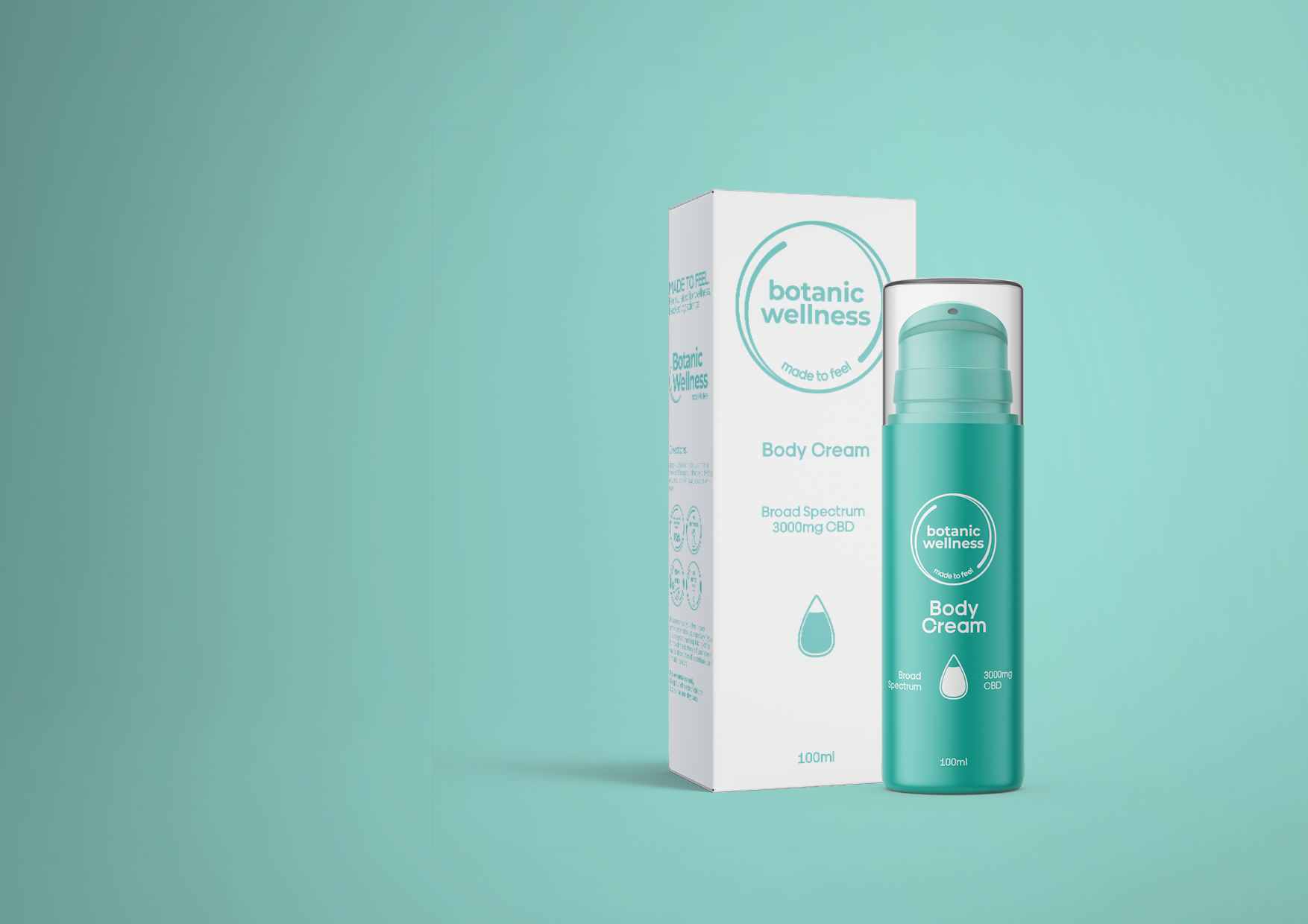
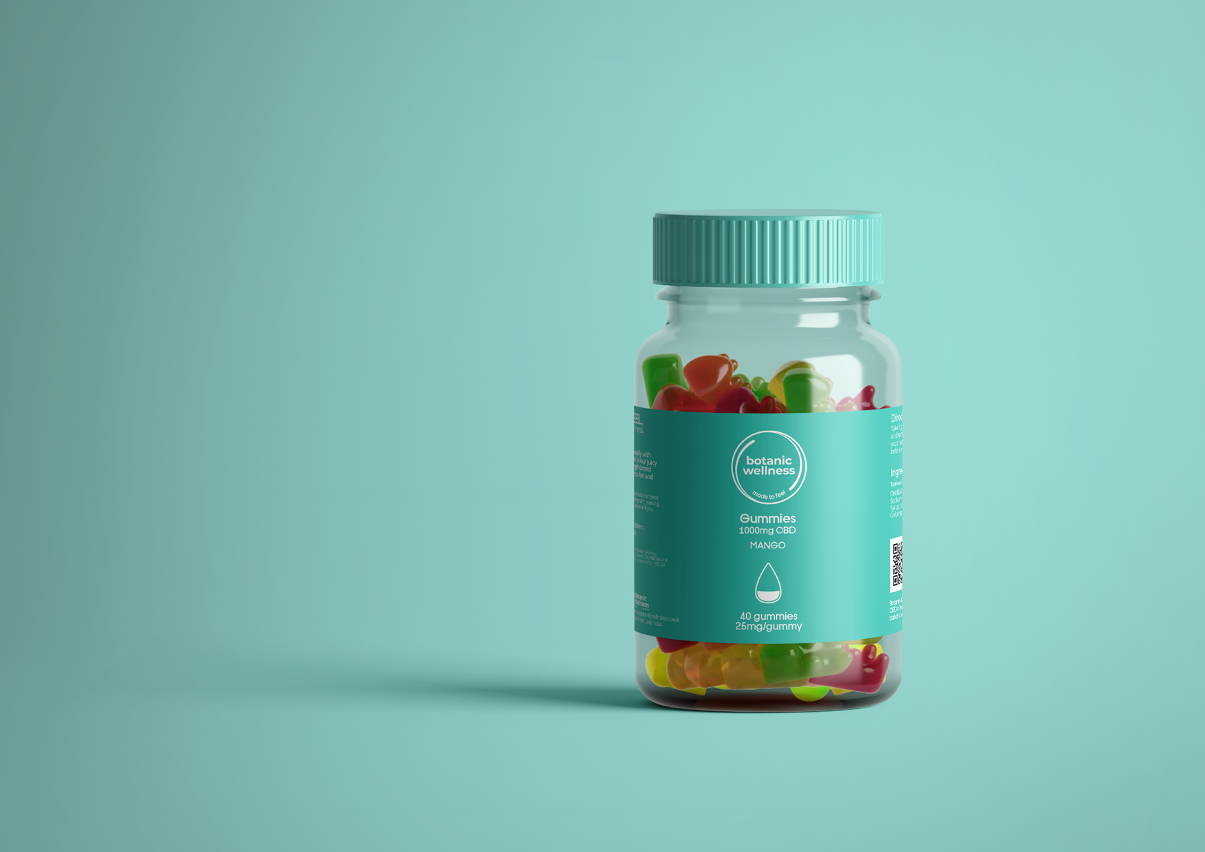
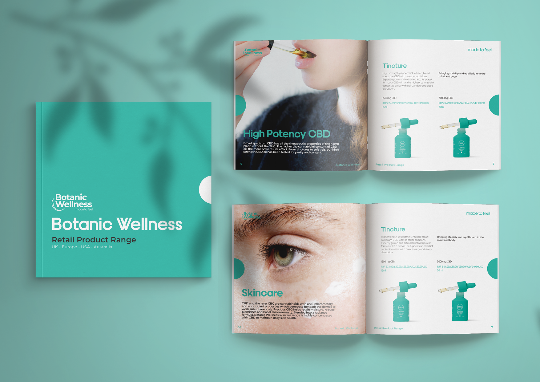
Botanic Wellness are a seed to shelf cannabis company based in Australia with distribution in Europe, the UK and US. Botanic Wellness (BW) are launching their own range of CBD products in Ireland and the UK.
BW aim to be the best value CBD in Ireland, available at pharmacy and health food stores and therefore catering to mass market consumers but with a focus on quality and with a high end feel.
The project, which began with brand design and packaging, is ongoing and aims to build a brand around trust, efficacy and scientific approaches to wellness. The brand needed to walk the line between shelf appeal and regulations in this sector; the goal was a brand that appeared as a skincare, wellness and medicinal product simultaneously.
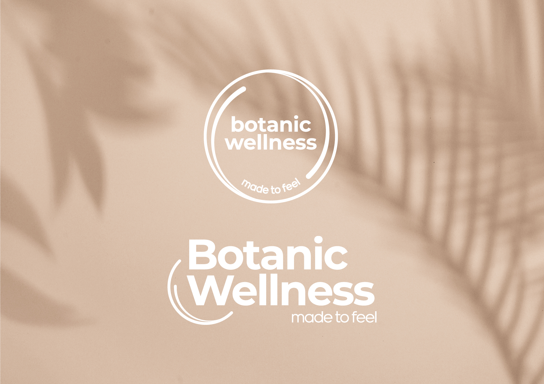
The logo device was born out of the concept of seed to shelf being a closed circuit and the calming effect of the products being likened to ripples on a lake. I developed two logo iterations; the circular version being more consumer facing, the horizontal working better for corporate settings. The brand has evolved into its application to packaging and promotional materials with the main blue green colour taking the lead on all visuals.
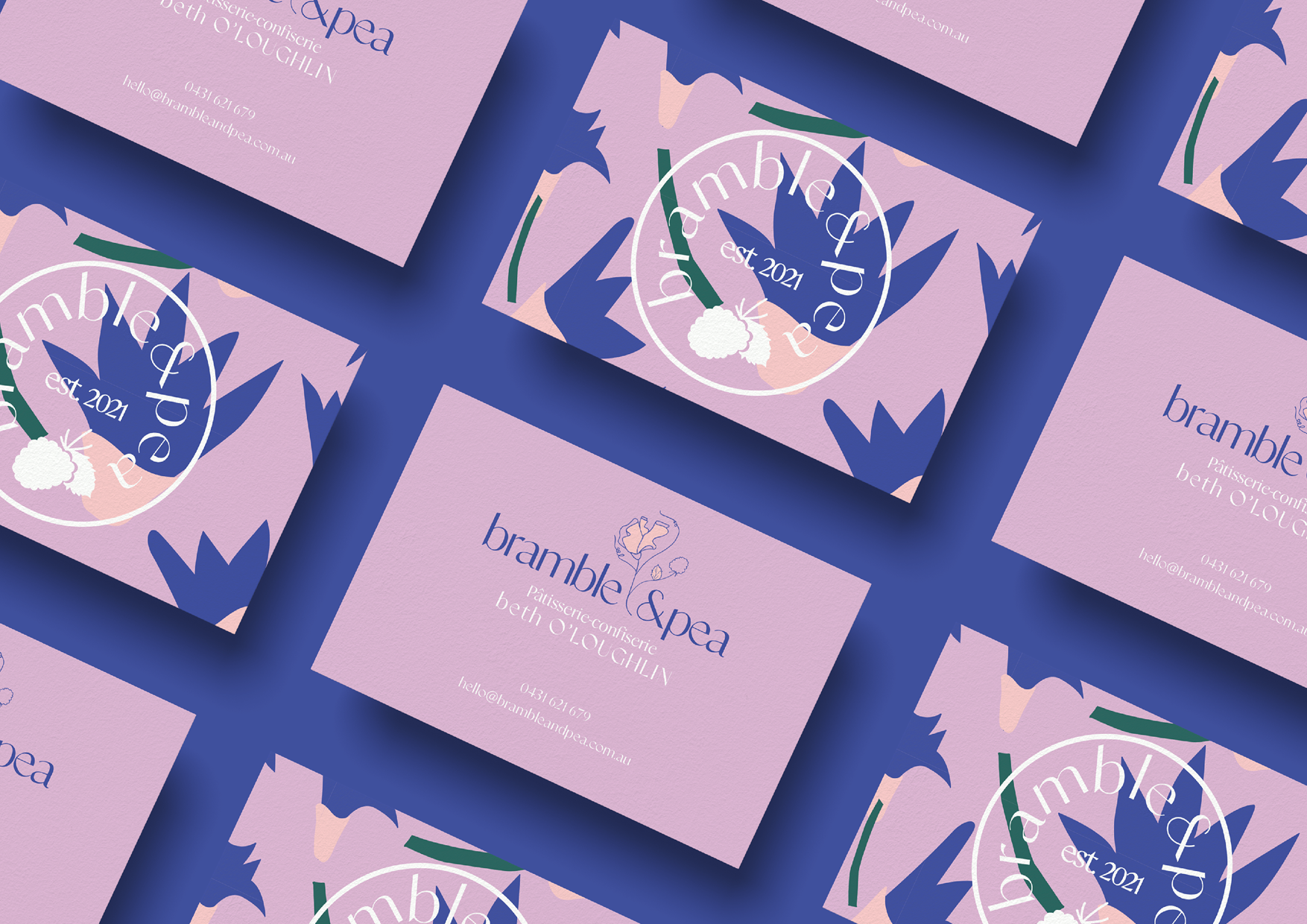
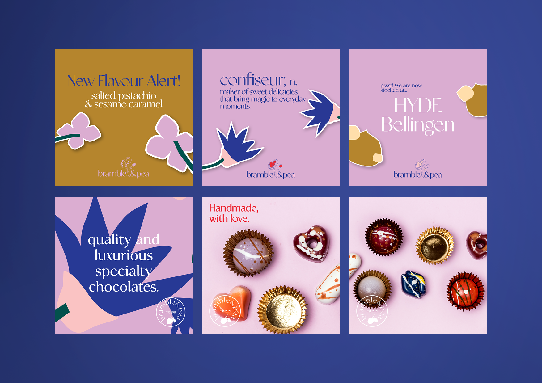
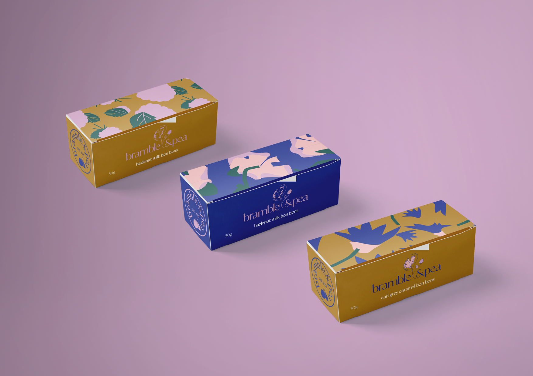
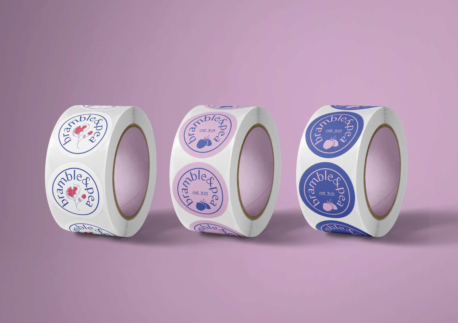
Bramble&Pea is an emerging handmade artisan chocolates brand based on the NSW mid north coast. Beth O’loughlan, an experienced and highly talented pastry chef, sits at the helm of this new venture. Her aim is to create a range of high end, delicious, moorish and lusted after chocolates. My aim was to craft a brand that matches her passion and enthusiasm and pulls in potential customers with spectacular visuals that align with Beth and Bramble&Pea.
In Beth’s own words, ‘Bramble & Pea is a luxury small batch chocolate business. Itʼs focus is on delicious flavours, beautiful presentation and giving people an experience to savour’. Flavours that will form part of the soft launch and product testing include earl grey caramel, passionfruit and ginger, maple macadamia and cardamon rose truffle, among others. Sophisticated, delicate, bold and luxurious.
The final brand is playful with an elevated and luxurious edge. I worked to blend together these two opposing moods using luxurious and classic serif typefaces with a vibrant colour palette and the childlike brand motifs. The Bramble&Pea brand is bold, modern, fresh and eye catching. We started with colour as a way to set the brand apart from its competitors. An explosion of riotous colour and shape was the goal. Child like cutout shapes elevated to art, these fun, quirky and bold motifs allowed me to build brand personality and style.