I have come to graphic design as a second career, after working in real estate, which has provided me with a strong understanding of the strategy involved in seamless customer experience and the value of listening to clients to determine their underlying motivations.
With the technical skills I have acquired and honed while studying, I feel an affinity with creating relevant design concepts that answer human-centred need and I know that branding and visual identity is the direction I want to take my career.
This is my passion - here I am.
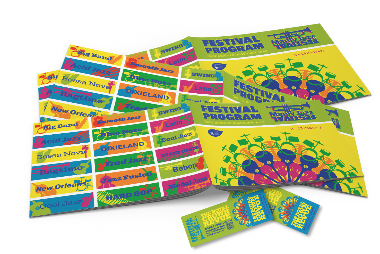
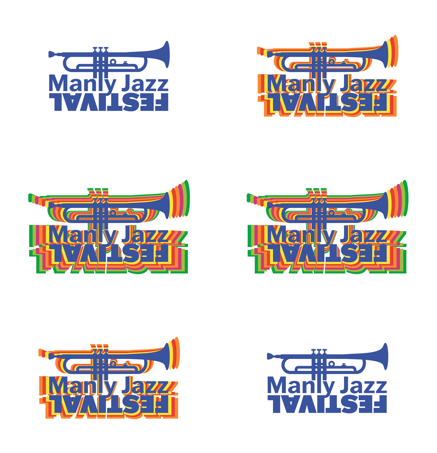
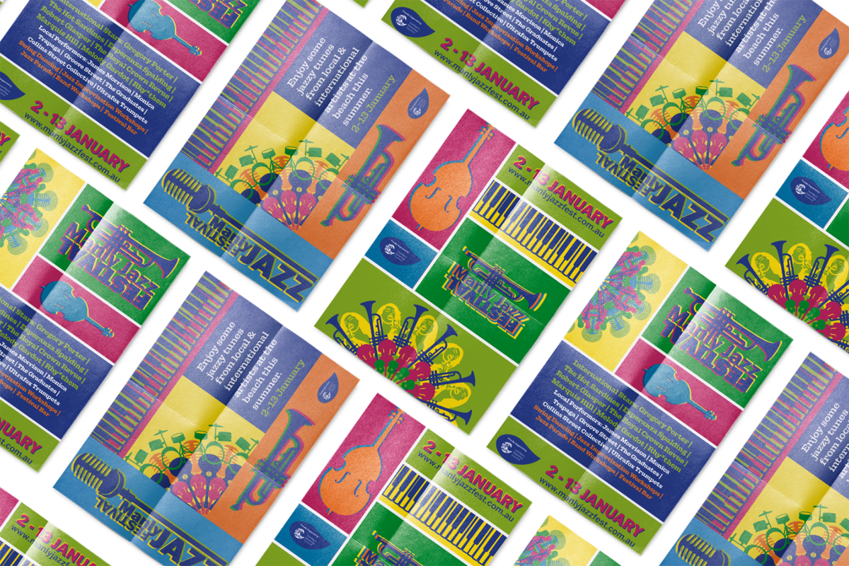
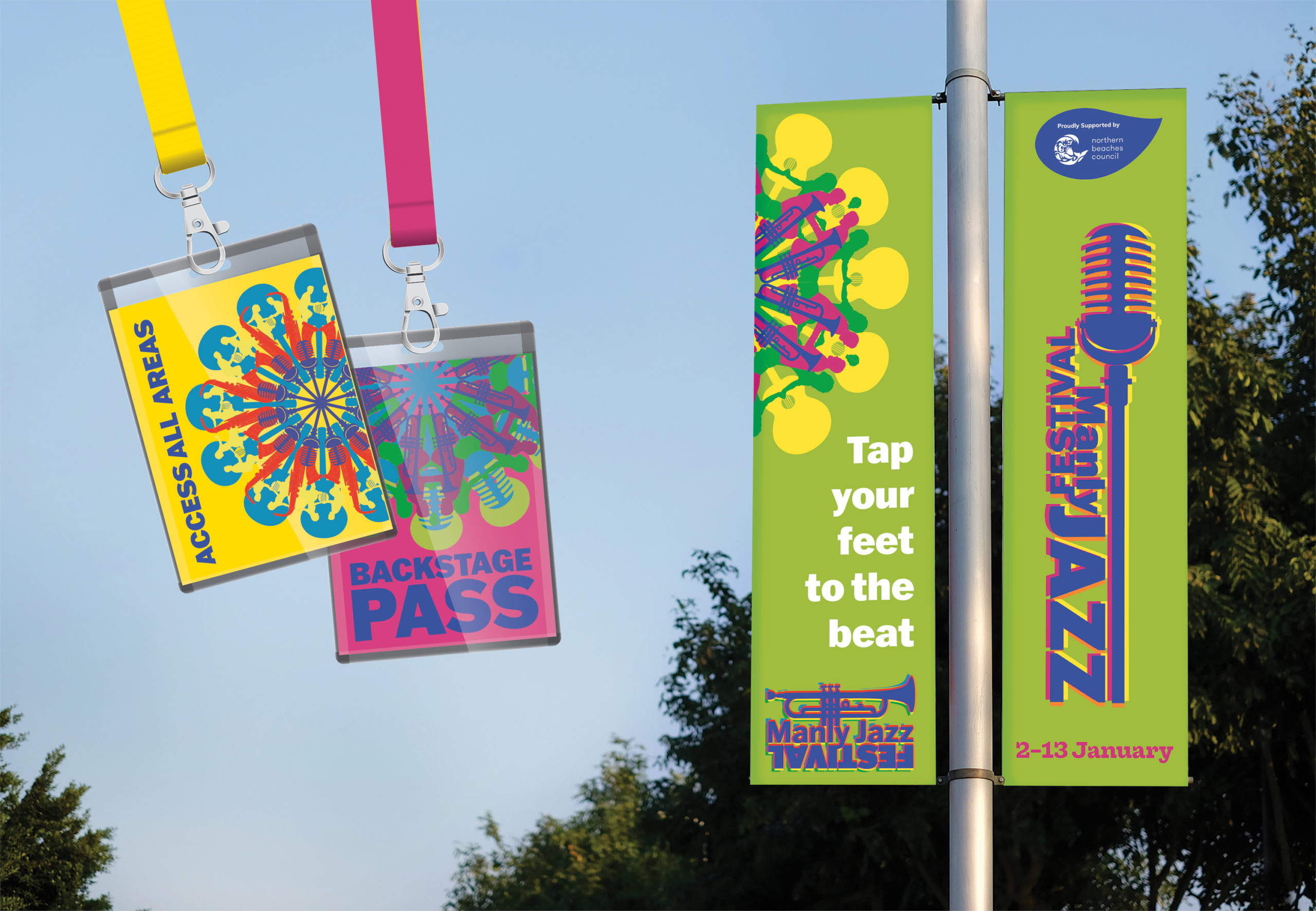
The Manly Jazz Festival has spect decades stuck in a rut of parochial maroon and gold. This new identity takes Louis Armstrong's famous jazz quote, "Never play the same thing twice", as a concept to capture the diversity & frenetic energy of jazz - with a kaleidoscope made up of the instruments as a repeated motif. The festival flies in the face of the typical low-ceilinged bar and takes jazz to the local streets, inviting participation. This upbeat attitude is captured in the range of saturated hues that make up the colour palette and the kaleidoscope which symbolises the inclusive nature of the festival.
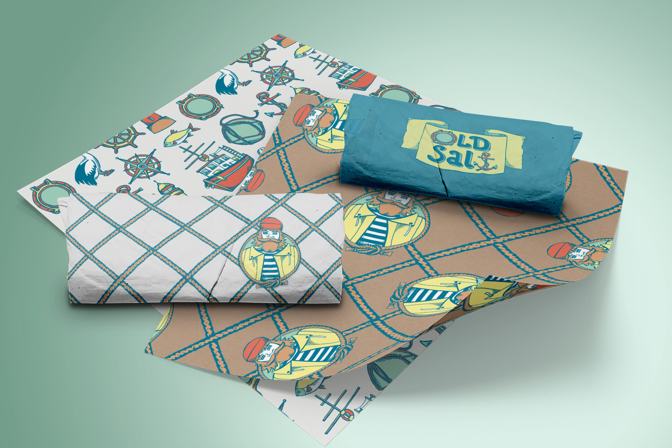
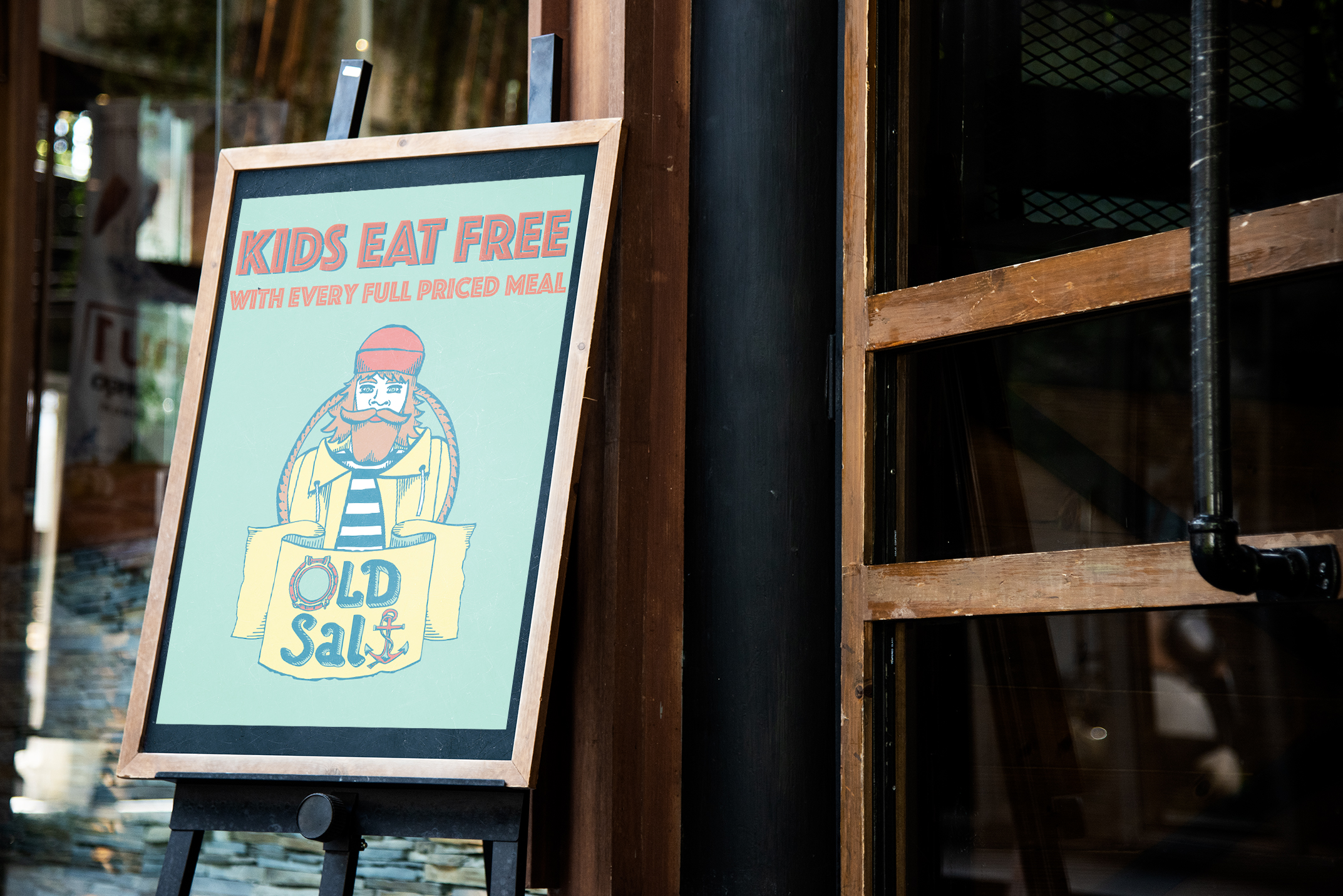
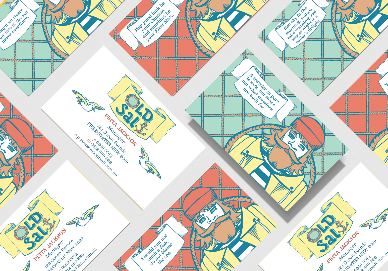
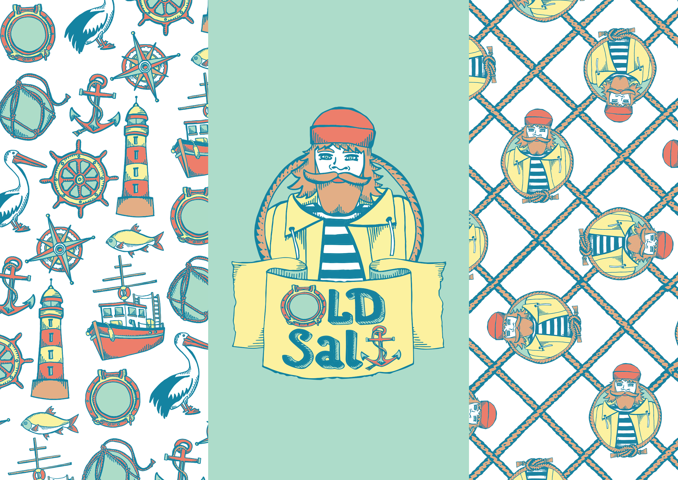
Old Salt is a local seafood joint with an illustrated identity that conjures up a Cornish seaside fishing village. An Old Salt is a story teller, with tales of the sea and a keeper of the myths and legends - the histories and traditions that are passed through generations. To capture this sense of tradition, I have in mind the turn of the last century as the spark point for the "look and feel", made modern with playful colour and bold graphics. The style of illustration is reminiscent of old wood block printing and engraving illustrations from the late 1800s-early 1900s era. The limited colour palette is fresh, modern and unexpected - a new take on traditional, seaside colours with a sun-faded look to them. The broad series of illustrated motifs provide a great range of cohesive outcomes.
