Growing up I always had a great appreciation for art, design, and architecture. When I was 11 years old my parents began renovating our family home. This experience combined with my week of work experience during high school at Cox Architecture in Perth solidified my desire to become an Interior Designer. I look forward to living out my 11-year-old self's dream, putting the skills I have gained in my degree to test, developing and learning as I go.
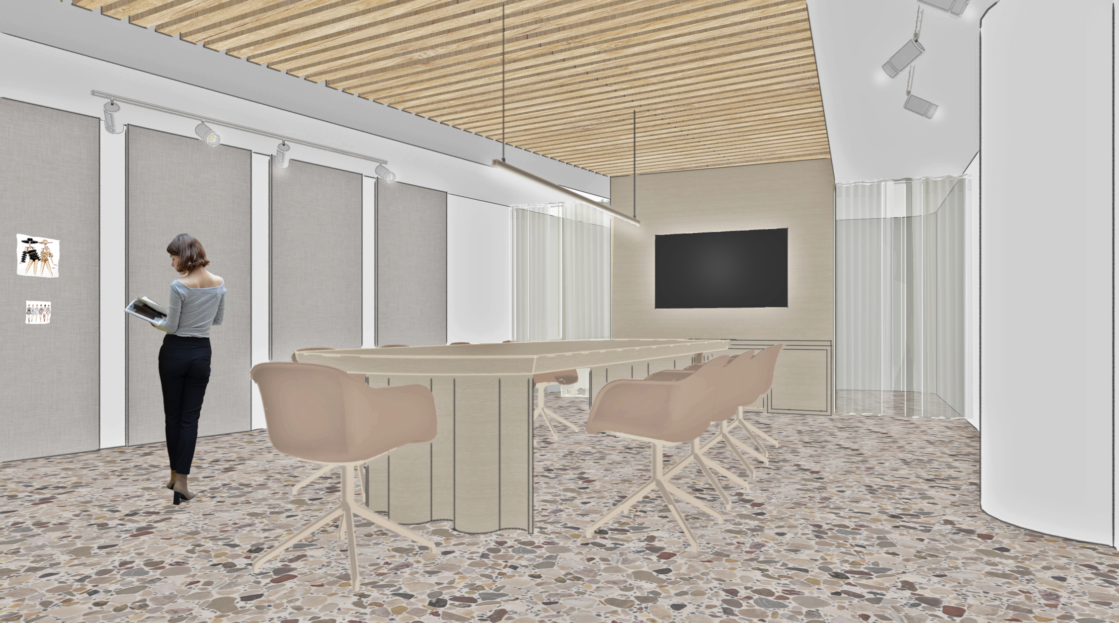
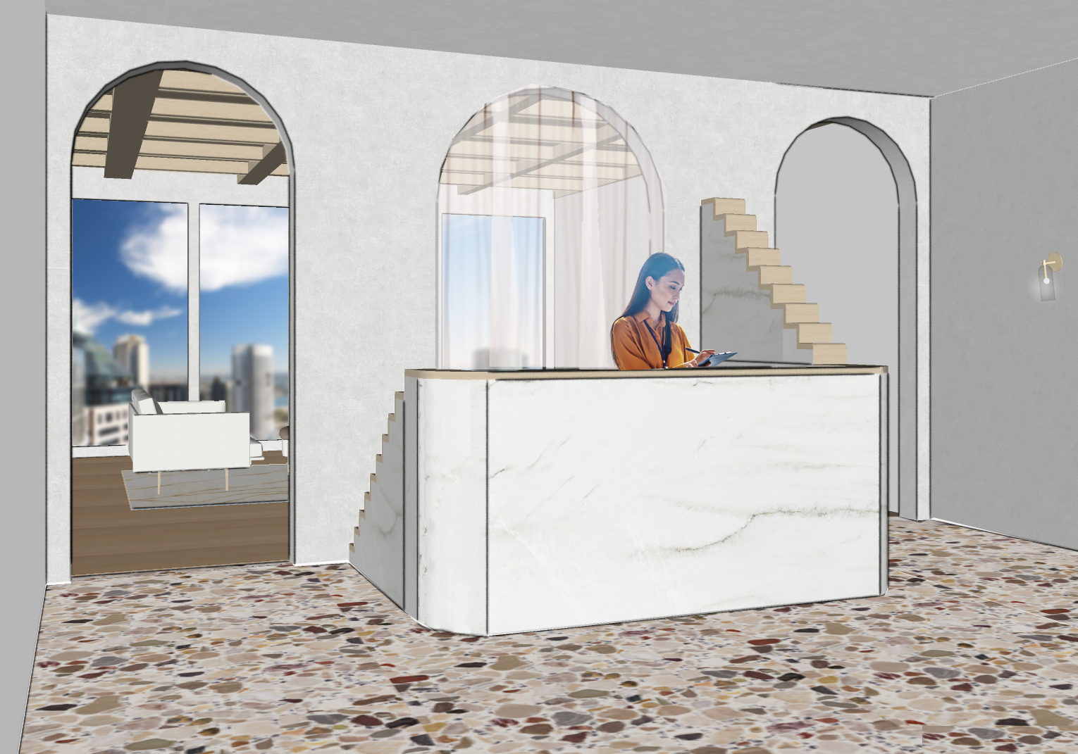
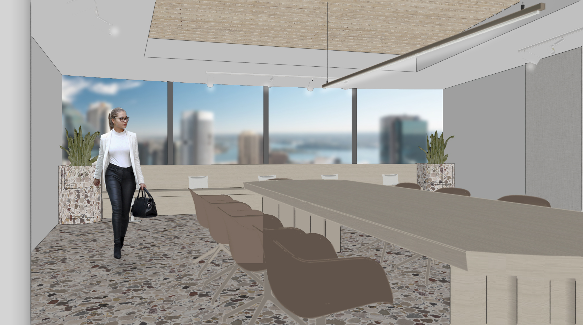
Zimmermann is an iconic Australian fashion label who are known for their resort-style merging swimwear with high-fashion. Located on the twenty-third floor of the quintessential 1 Bligh Street Sydney, Zimmermann's new Australian headquarters embodies the brand's luxurious coastal contexts. With stunning 360 degree views of Sydney, the site is a premium grade office building with sustainability and quality of work-life at the heart of its design.
The client brief called for a functional and beautiful office space that nurtures creativity and collaboration. With the brand's product designed in Sydney, the client required a fully functioning design and photography studio along with a large library to help stimulate creativity.
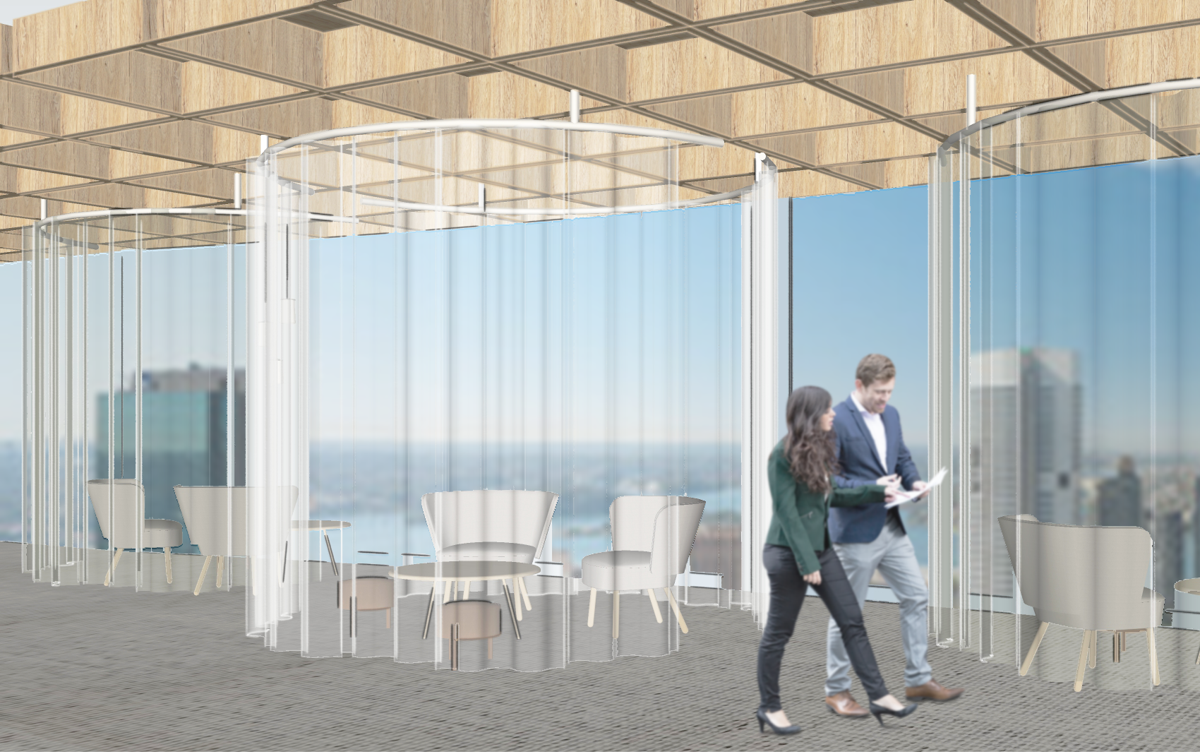
The design takes inspiration from scenes along the Mediterranean coast. Sand coloured Tasmanian Oak, Italian terrazzo, and gentle drapery aim to evoke emotions of nostalgia towards past travels. Ergonomic furniture and acoustic timber ceilings provide the utmost comfort and support.
A methodical approach was taken for the spatial layout, with inspiration drawn from the symmetrical floor plans of European Renaissance Architecture. The layout places the social areas towards the centre, surrounded by a circular array of the more private zones. This approach means areas where the most time is spent have access to the views, evoking a sense of freedom that ensures the best possible working environment.
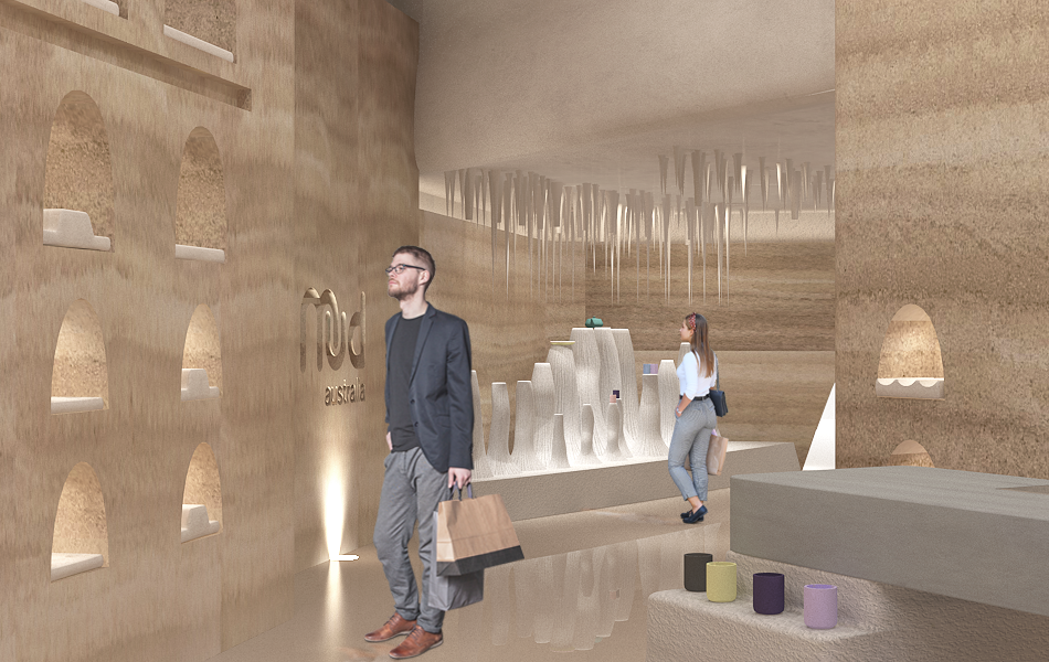
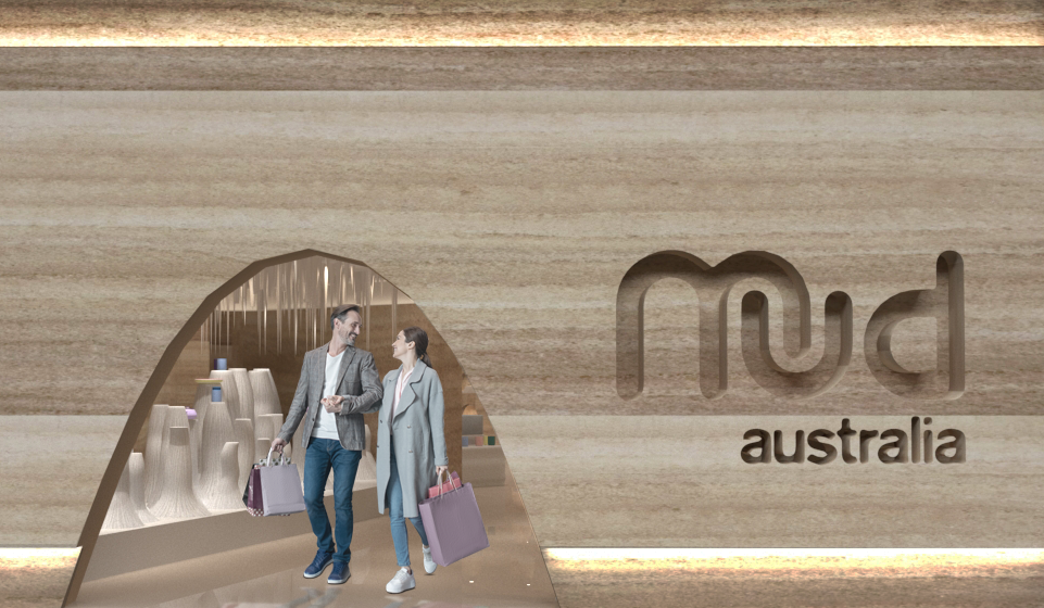
Australian ceramic brand Mud, was formed from the notions of practicality, beauty, and passion. Mud's new Melbourne flagship store pays homage to the history and culture of ceramics, which dates back to the Neolithic Period. Discoveries of the earliest known pottery were found in cliff-side cave dwellings in Japan. Mud's new store embodies this discovery, becoming a retail experience that is full of excitement and wonder.
The client's brief called for strong brand identity throughout the design and consideration of the customer's journey. It was also important to the client that only high-quality, environmentally friendly materials and finishes were used.
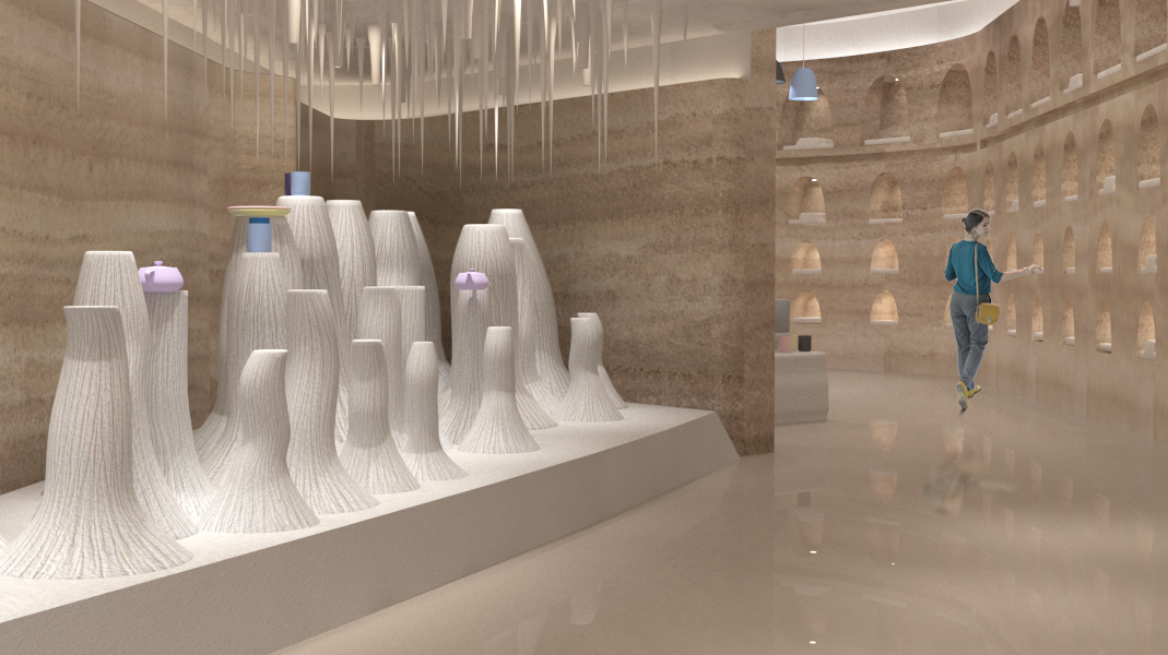
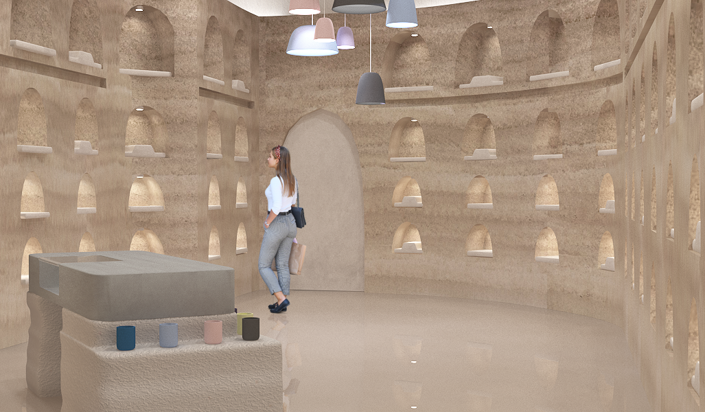
Upon entry, products are introduced to the visitor in an eye-catching stalagmite-style plinth display. Mud's distinct matte and glossy finishes are reflected in the gentle contrast of smooth rammed earth walls, textural clay plaster, and polished floors. Much like the company itself, this retail space exhibits only natural materials and finishes, sourced exclusively from Australia.
As you cross the threshold to the backroom, the ceiling lifts creating a dynamic contrast to the more cost front room. The towering curved wall of illuminated alcoves winds around to the Neolithic style counter. Each alcove holds a bespoke cast plaster insert, designed to showcase MUD's unique range of ceramic forms.
