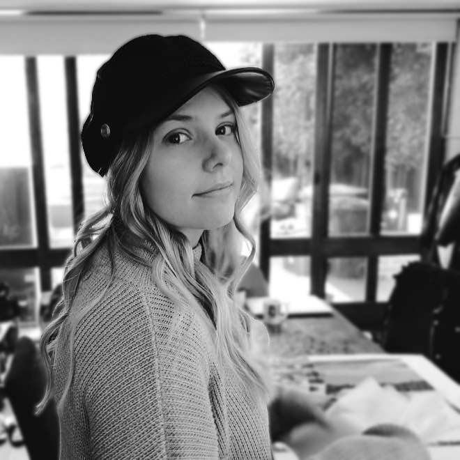
Hi, I'm Ashleigh - a Townsville born, Brisbane local with a colourful and versatile creative background.
As a Graphic Designer, I’ve always had a love for illustration. I am inspired by the world around me and I am motivated my colour. My creative pursuits reflect vibrant, eye catching, mood evoking colour palettes that tell stories and demand attention.
While Illustration and Branding are my two areas of interest, I am constantly driven by a strong curiosity to learn new things and expand my toolkit - enabling me to create engaging and meaningful visual solutions with minimal boundaries.
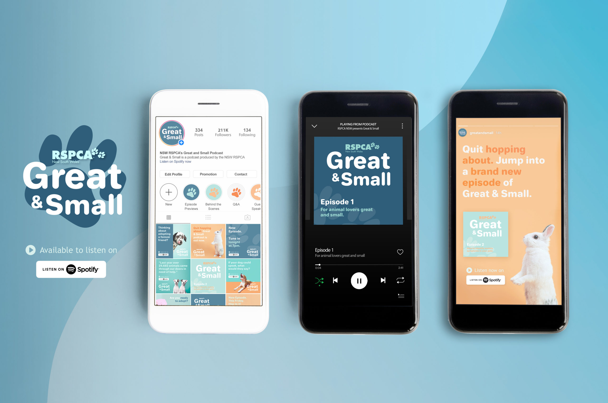
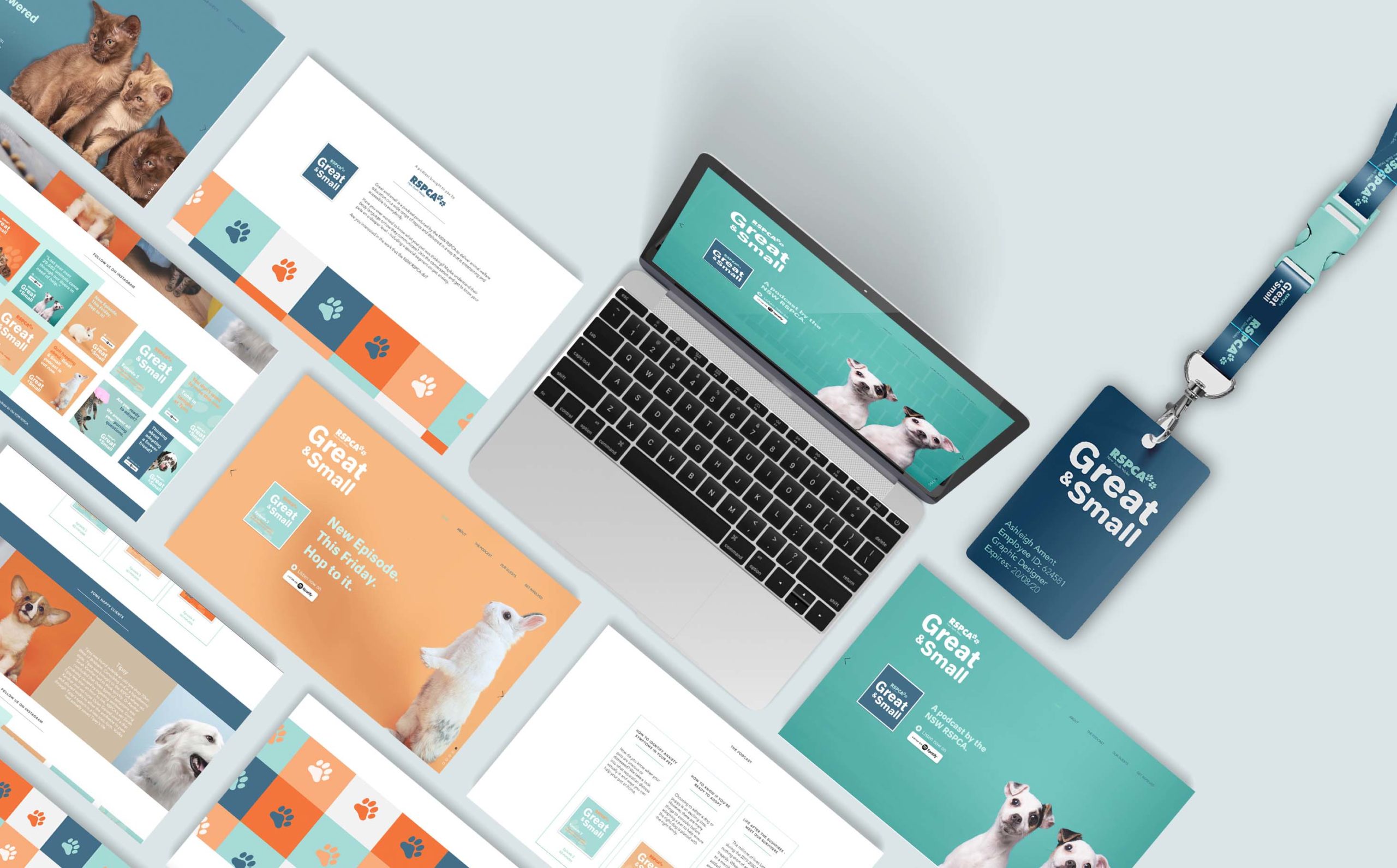
Great & Small is an upcoming podcast produced by the New South Wales RSPCA to deliver animal welfare education to a wide audience. With a desire to reach a younger demographic of listeners and supporters, the NSW RSPCA requested a new brand identity for the podcast supported with a strategic marketing campaign and a visual style guide to promote the launch and support future growth.
When researching the space in which younger listeners might engage with a podcast, it was evident that most opportunities presented themselves in the digital space. I understood the challenge of creating a strong brand identity that strand out on digital platforms that are very heavily trafficked - and developed a plan that focuses on colour and tone of voice to bring the podcast identity to life and engage a younger audience.
Colour
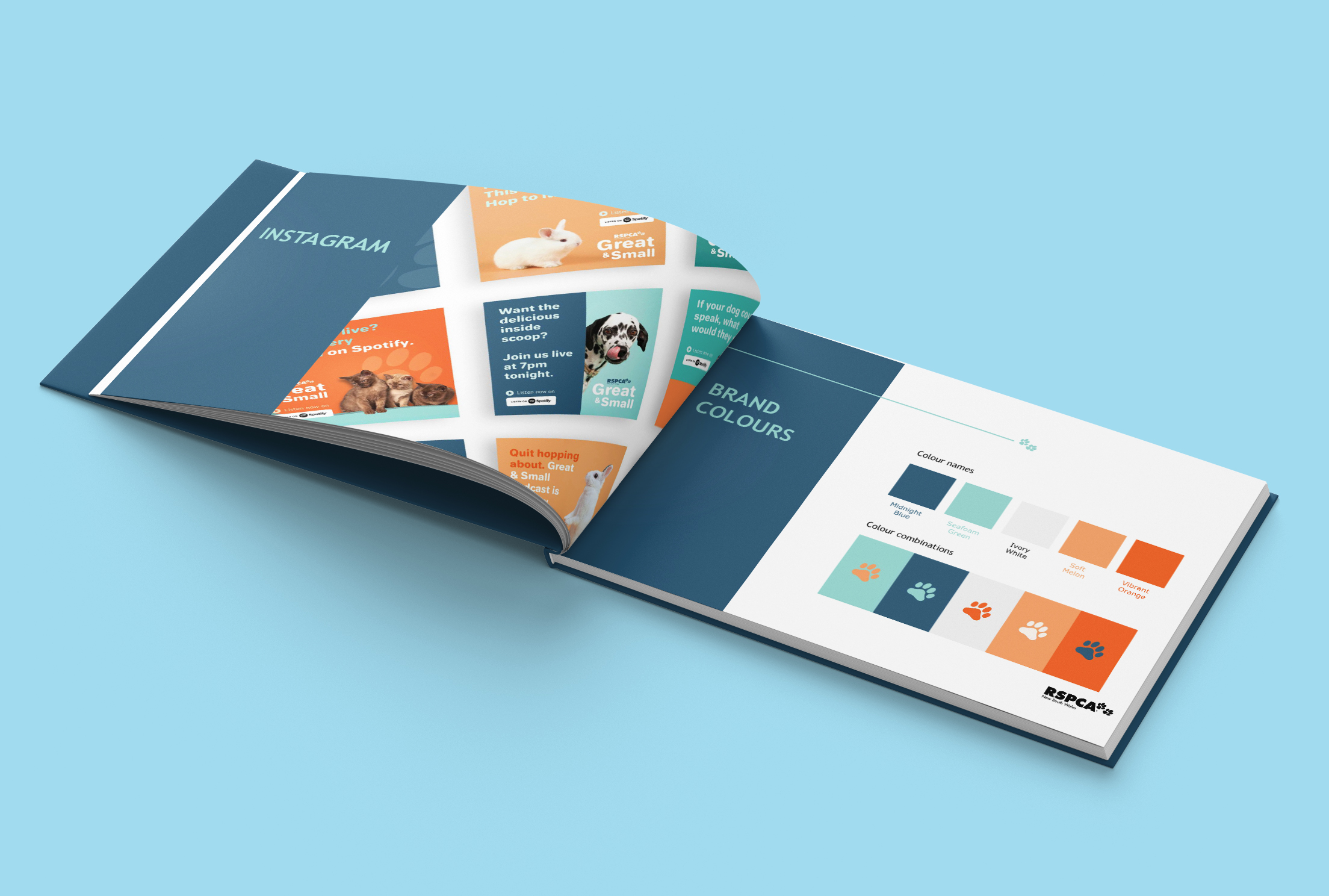
My visual solution included a brand new colour palette developed specifically for the podcast Great & Small, consisting of 5 colours that work together in almost any combination. Drawing on the success of the original brand identity of the RSPCA - the new colour palette features a refreshing combination of blue and green, with a hint of vibrant orange.
Tone of voice
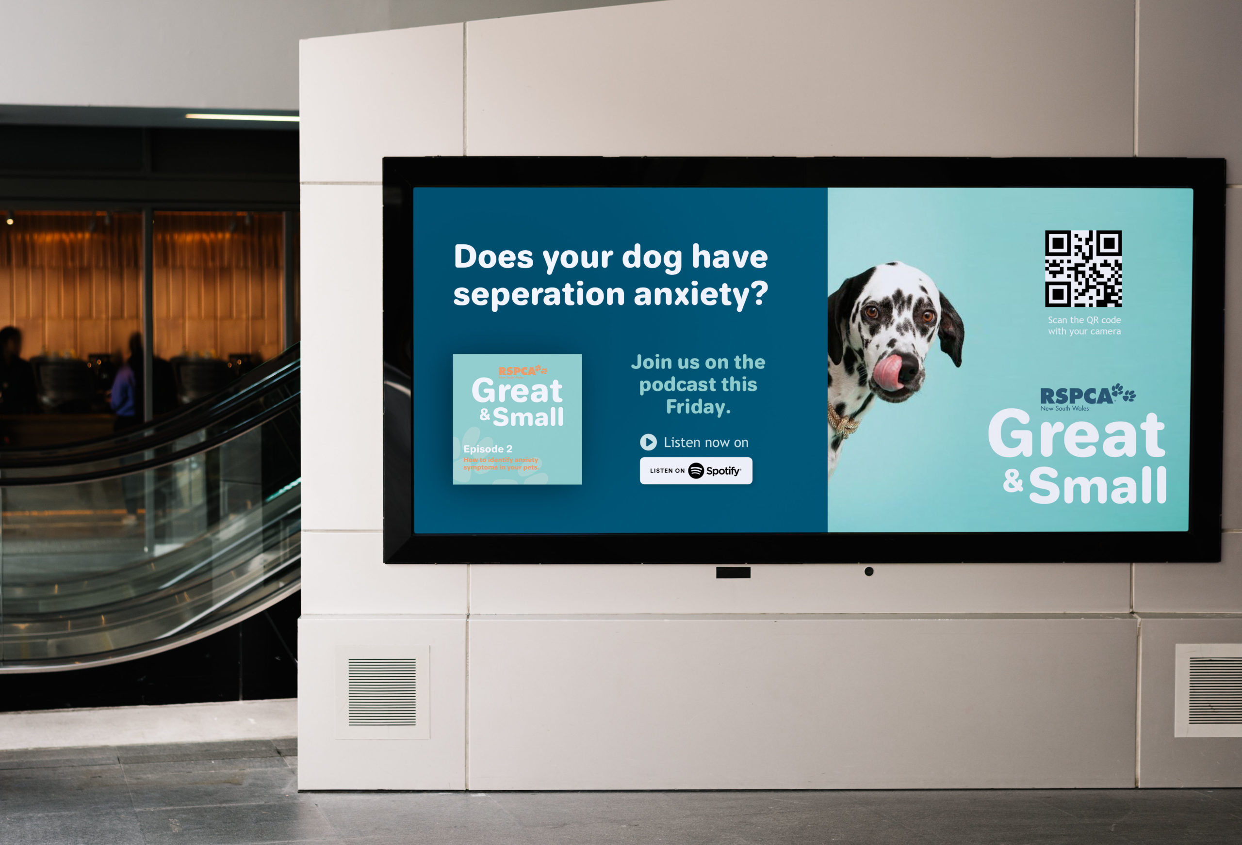
The tone of voice used to speak directly to listeners is casual, conversational and engaging - achieved by using click-bait style headings, quotes and snack-able content that engages the user immediately.
Logo
The Great & Small logo was developed to illustrate an open and approachable tone of voice. The logo provides the podcast with an identity which is easily recognisable across multiple channels.
Snack-able Content
Click-bait style headings, to-the-point copy and engaging visuals that can be easily consumed by the user are essential to engage a younger audience effectively.
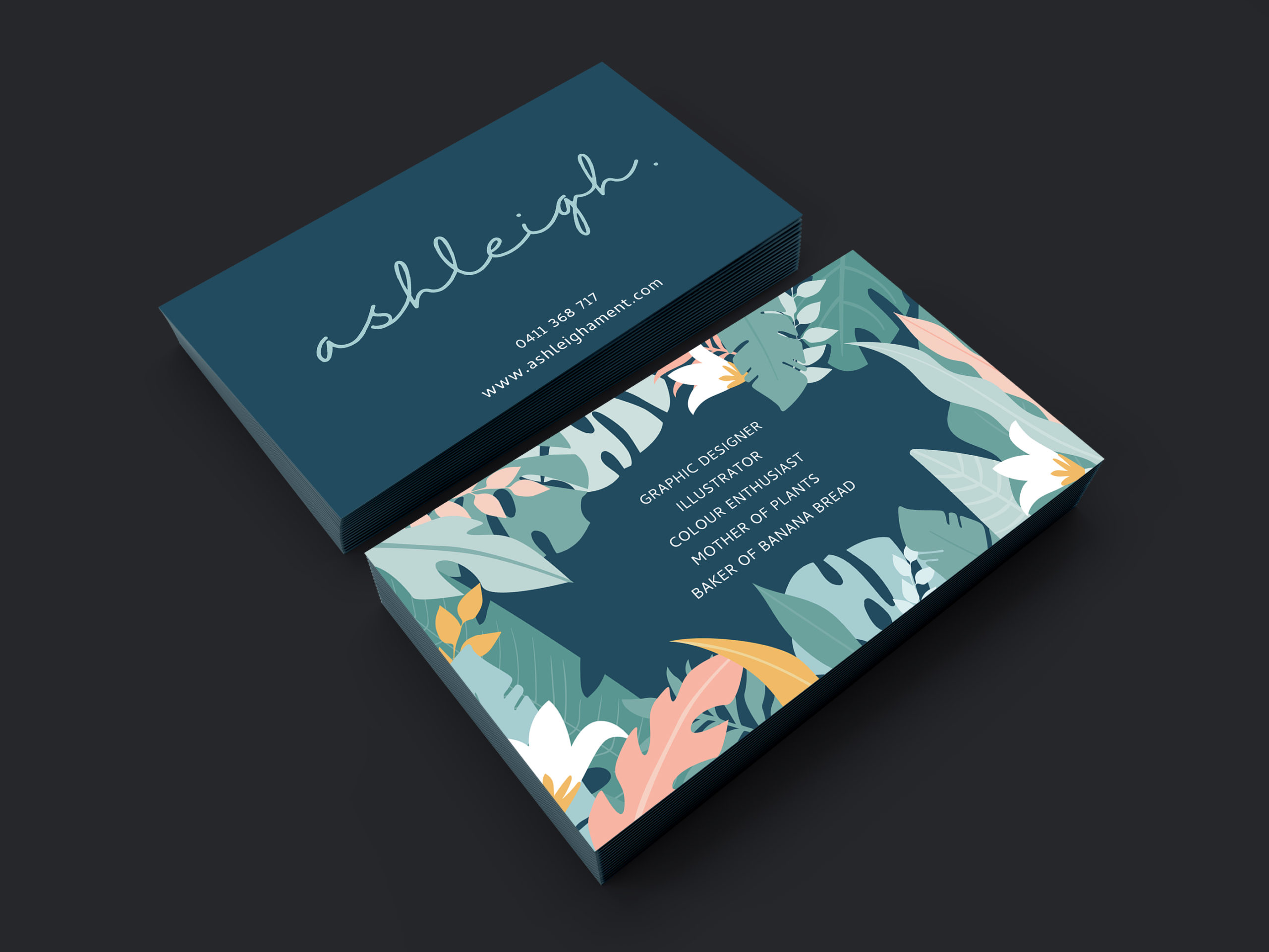
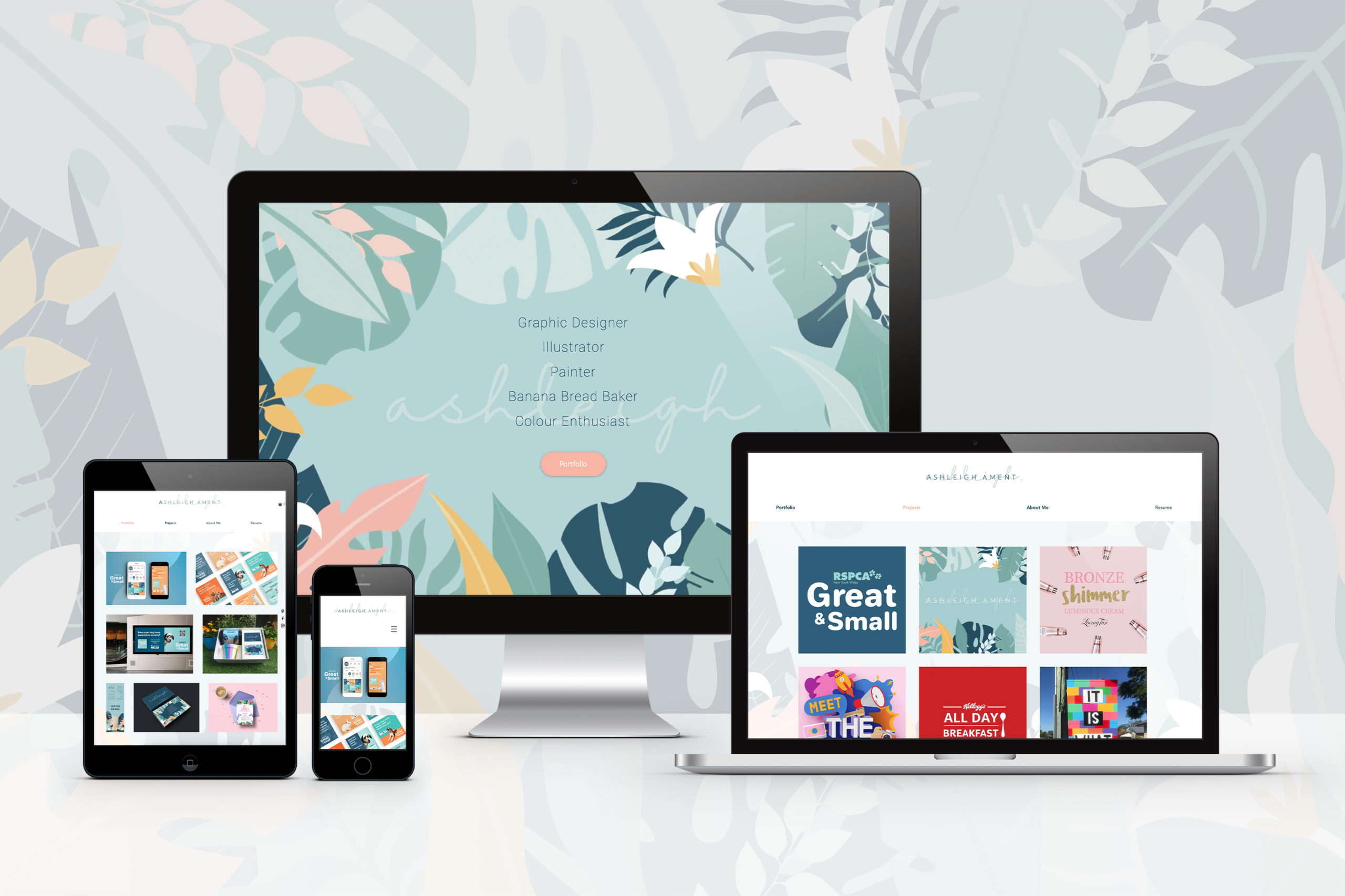
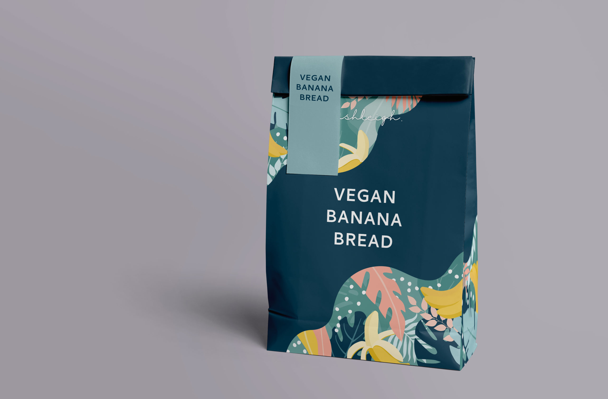
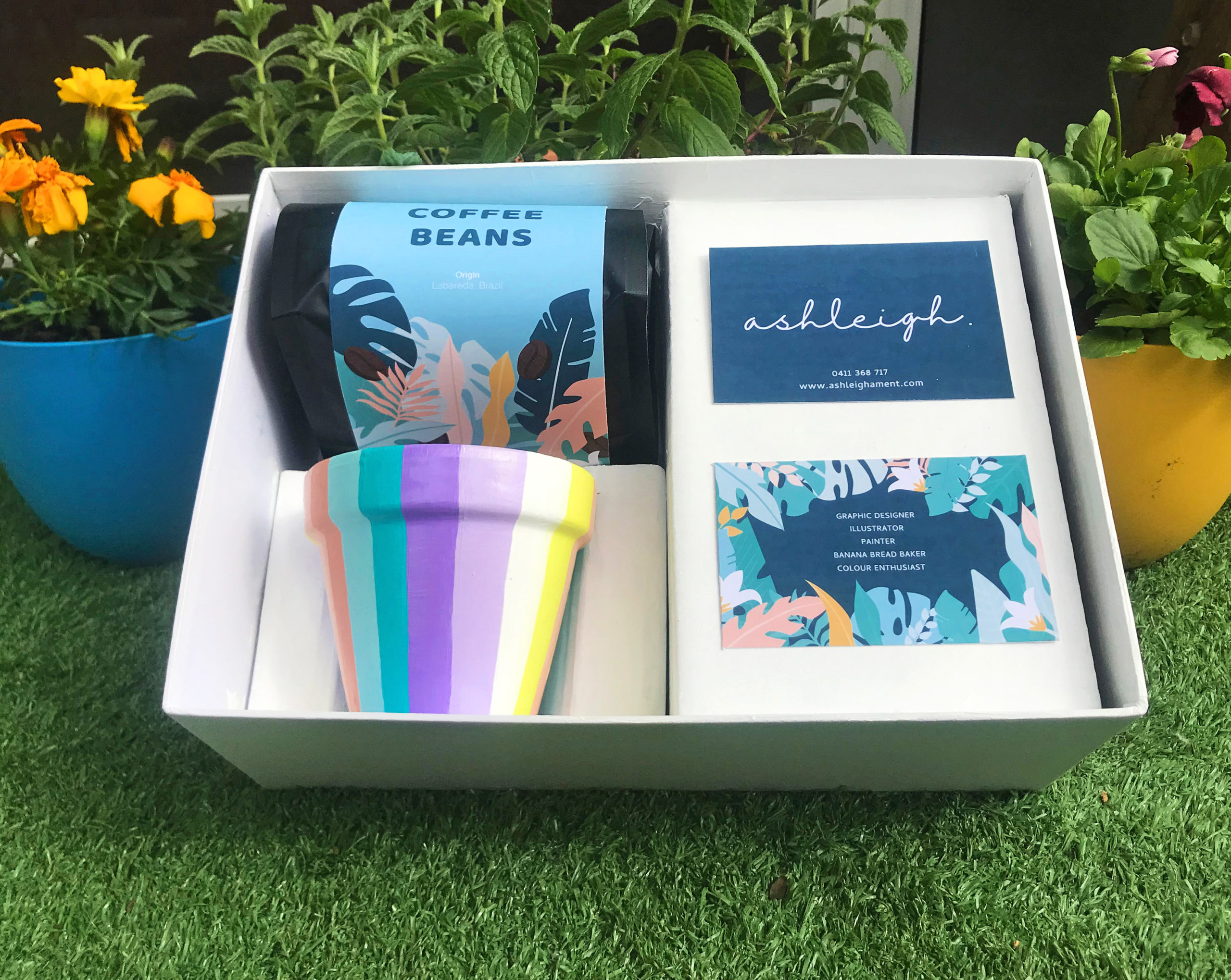
This project involved the development and creation of a personal brand identity to promote myself professionally and personally in the design industry.
The question of who am I resonated deeply with me when considering a professional career in the industry as a Graphic Designer - however, as I began to understand my own ambitions, personality traits, goals, hopes and dreams - I discovered more about who I am as a designer and how I wish to promote myself in the industry.
Two key themes emerged in my research and self-evaluation: Versatility and Colour.
Versatility: When I assess my work, it’s clear that my design style is versatile. I have created many designs across a wide span of mediums - from print, digital, interactive, animation, public art and hand-painted designs. Versatility is something that is highly regarded in the design industry as many prospective employers seek a jack-of-all-trades designer who can adapt to any brief and has a diverse set of skills.
Colour: Colour is a driving factor in all of my design work - from personal projects to commissioned illustrations, everything that I have produced is driven by a strong, vibrant colour palette.
The deliverables for this project include a suite of promotional pieces aimed to engage prospective employment opportunities by introducing myself as a Designer.
