As a designer, I have a strong understanding of spatial planning, architecture, and the potential of any space to be resolved and modified innovatively. When it comes to design, I always start from the very beginning, which is the “why” of the design. I will always identify the user, purpose, meaning, contextual situation and use that to create a unique concept for the design. I believe great designs are extensions of the user and I strive to generate environments that manage to communicate their story profoundly.
Strategic thinking, creativity, a positive attitude, commitment, and willingness to learn are some of my strengths. I have extensive backgrounds in architecture, retail, and even in the finance industry, and coming from a place with multicultural background has also given me the advantage to observe things from many perspectives and abling me to solve problems with creative solutions. It has also allowed me to not only design with a sense of art but also from a functional and business perspective to maximise the user experience.
I always challenge and push myself to the limit, and I am looking forward to making more contributions to the design and art industry in Australia.
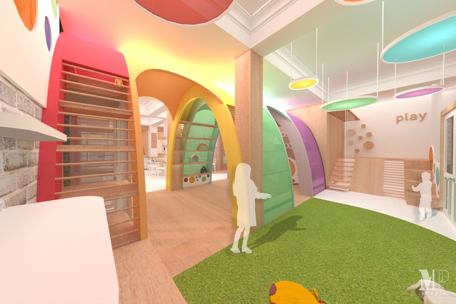
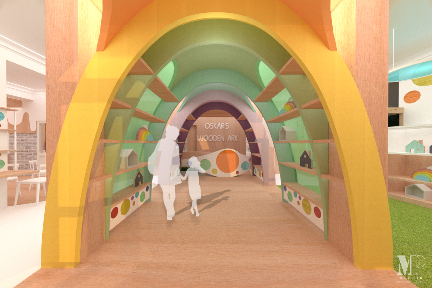
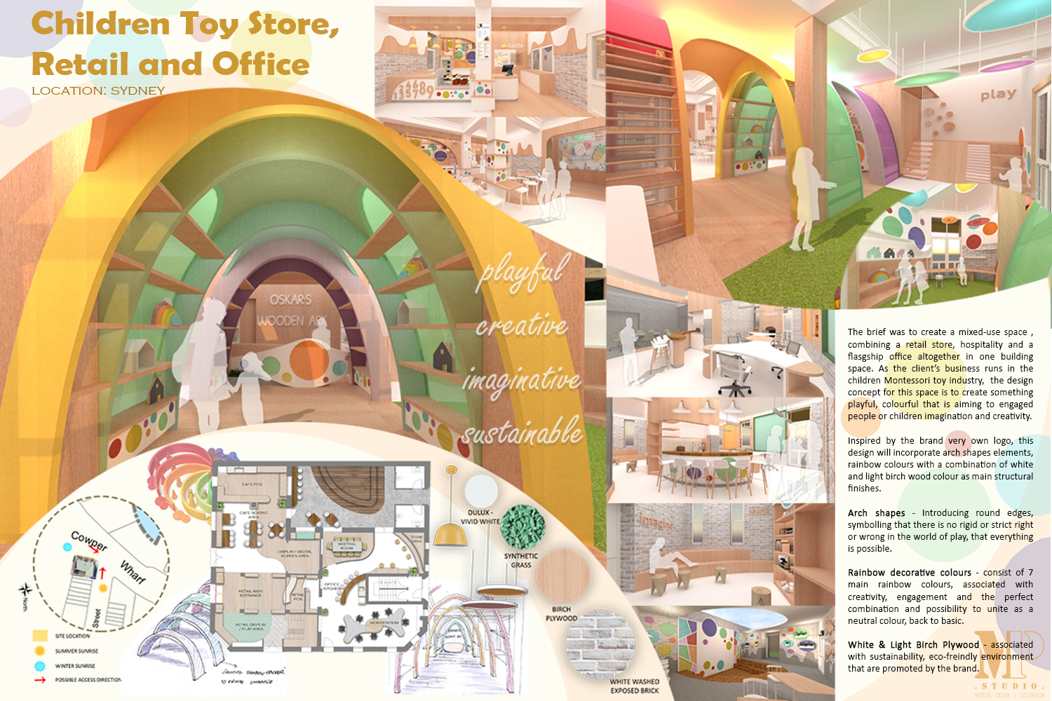
Conceptual mixed-use retail, flagship office, and hospitality, for a company running in the children Montessori toy industry, located in the heart of Sydney. The idea and concept for the interior are to create a playful and memorable design, taking inspiration from none other than the Montessori educational toy brands, combining all the playful colours, with the 7 basic rainbow colours used as the main colour guide.
A simple white finish with a touch of the wooden element will then be used for the rest of the spaces to complement the rainbow colours, creating a warm yet clean ambience to the space. The wooden element used also represent the sustainability of the products that this company offers. This concept will be incorporated in all functions of the space, with the aim to create one whole design unity, showcasing the essence and characteristic of the company.
Inspired by Grimm’s stacking rainbow, one of the most famous and popular Montessori toys, a rainbow frame is designed as the main entrance feature with the aim to catch people’s attention when they first come into the store, as well as setting the tone for the rest of the space. Meanwhile, in the retail area, a series of custom patterned circle panels in rainbow translucent glass will be introduced as the main pattern for the brand and will be used throughout the spaces within the building to create a design unity. All corners will be made round as well to create a child-safe design so they can browse and play freely.
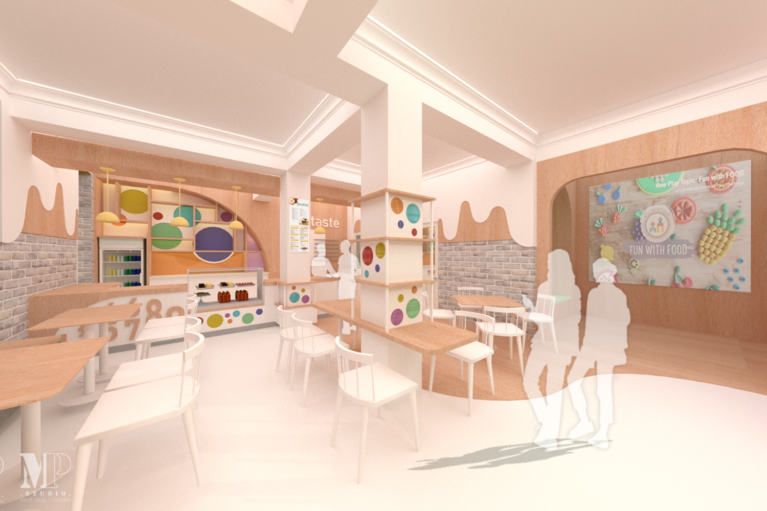
The cafe/ hospitality area is located opposite the retail space. The mood will be a continuation from the rest of the retail area, with the series of custom round patterns imposed as well. There's also a digital presentation space with an interactive wall to hold any special events. This hospitality area casually flows and extended to the outdoor area, where there would be extra tables and seating with an amphitheater setup also designed in the space to provide additional seating area as well as to hold any special events.
In conjunction with the company characteristic, a flexible layout is employed in the office area, to create a more approachable setup between the co-workers. A big ‘joined’ work station is designed in the office area so that the staff can do their work as well as having a casual meeting at the same area. There is also a creative space, designed as a mini indoor amphitheater near the outdoor area where employees can sit and have their brainstorming session in a relaxed environment.
Programs: AutoCAD, Sketchup + Vray, Photoshop
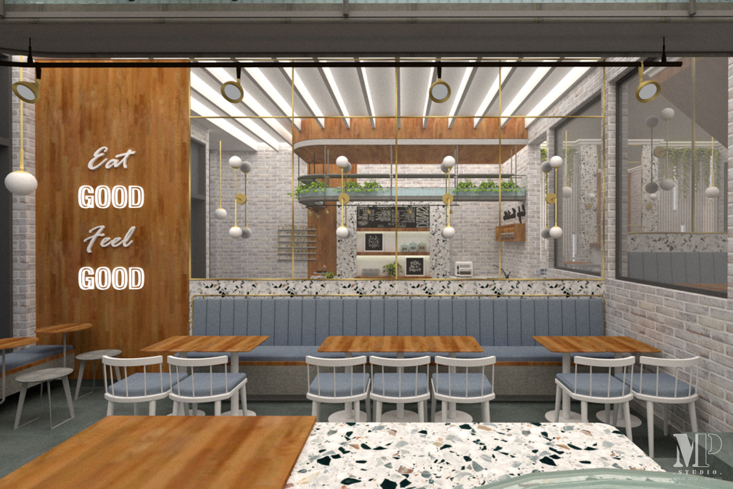
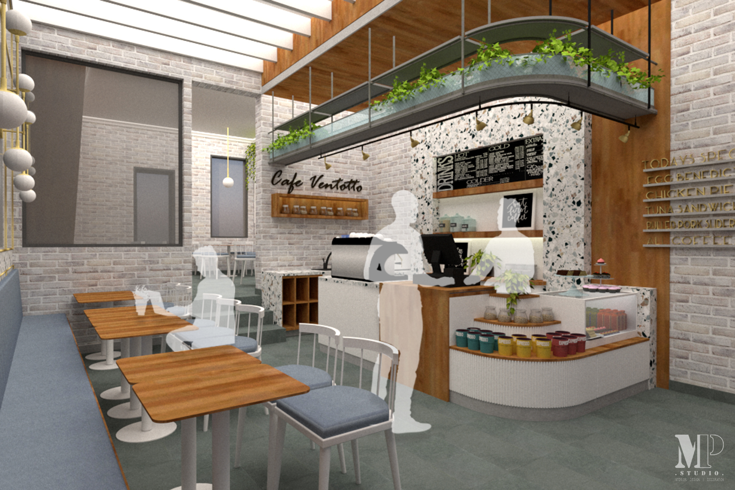
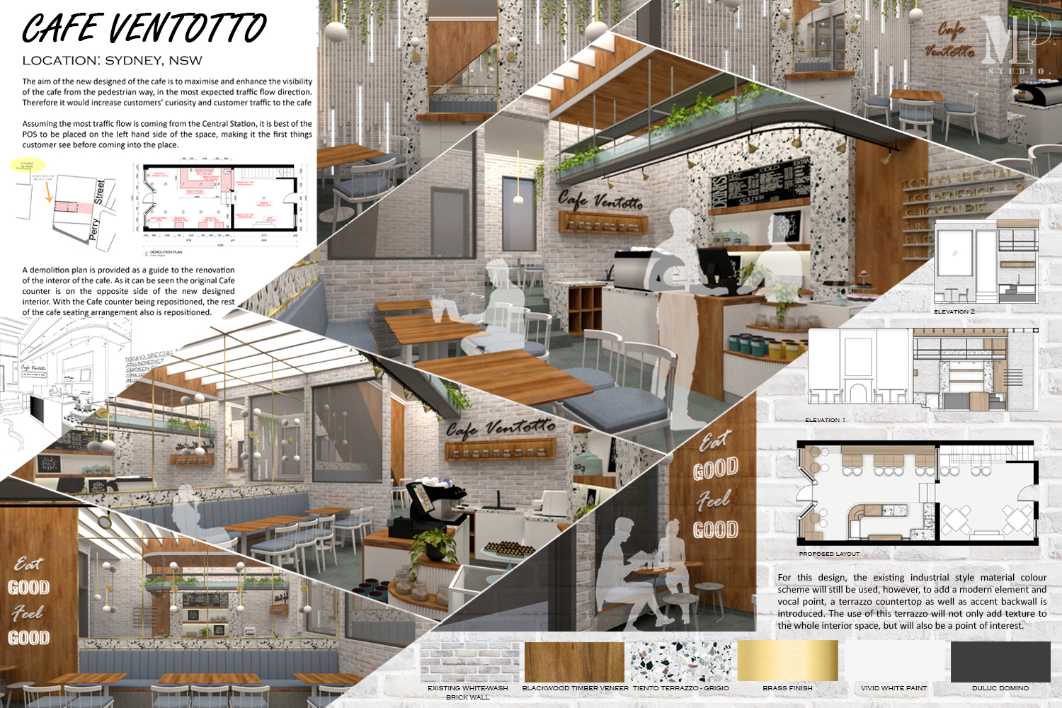
An interior makeover project for a Cafe in the heart of Sydney. Using the existing exposed brick wall, this design aims to add a modern element and vocal point by introducing terrazzo as the main stone finish, combined with natural timber veneer and fabric for a pop of colour. With different patterns and colours inside the terrazzo, this material can easily be a feature and eliminate the previous old-school vintage look of the cafe.
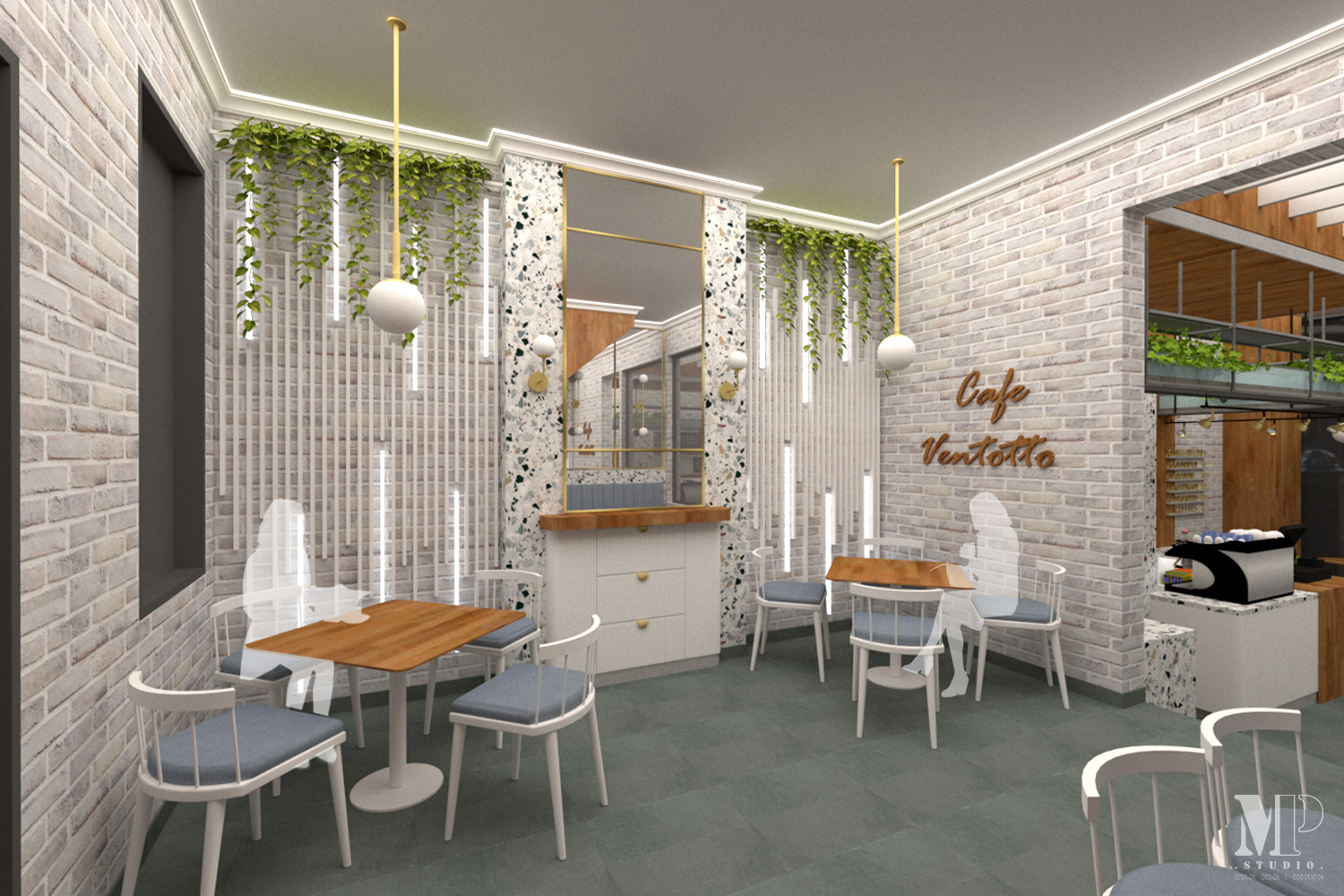
The existing cafe layout is divided into two areas, the front and the rear dining area, divided by a solid exposed brick wall. A wide opening is therefore designed on the wall to make a continuation between the two areas.
On the counter facing the front of the store, a dropped bench rounded countertop is made. This design is made to create a welcoming sense of space, inviting the customer to come closer and interact with the staff freely, rather than having a rigid box-shaped service counter. This dropped bench can be a display shelving at the same time, displaying promotional items or things to sell. Opposite the cafe counter, there is a bold wall made of timber with a quote/ signage light-up lettering to become the accent and iconic signage of the space.
A booth seating type is also designed for the dining area to maximise the limited and narrow space of the cafe, as well as providing flexibility of a number of table arrangements. The back wall is covered in a fabric cushion for the back of the seating. Meanwhile, the upper wall is covered in mirror glass finish with gold lining to create an illusion of a bigger space to the narrow and long area of the cafe. Terrazzo is also used as a separator between the fabric cushion and the mirror glass.
Programs: AutoCAD, Sketchup + Vray, Photoshop