I'm Dan, a Senior Graphic Designer and Branded Environments Lead living on Gadigal Country, Sydney. I love to build brands and explore placemaking and narrative through the built environment. I am keen to connect and collaborate with a mentor, so please get in touch if you're interested. Cheers, Dan.
The brief was to engage in design research and develop our project/product with a 'for-good' approach and outcome. I choose to focus on the development of a brand and subsequent product skus that leveraged sustainable resources to create a product that felt familiar and natural. Through conducting semi-structured interviews and reviewing existing quantitative research I developed a profile of the expected brand and product characteristics. I then used these characteristics as a base to develop the brand and products best suited for the Snack Food category.
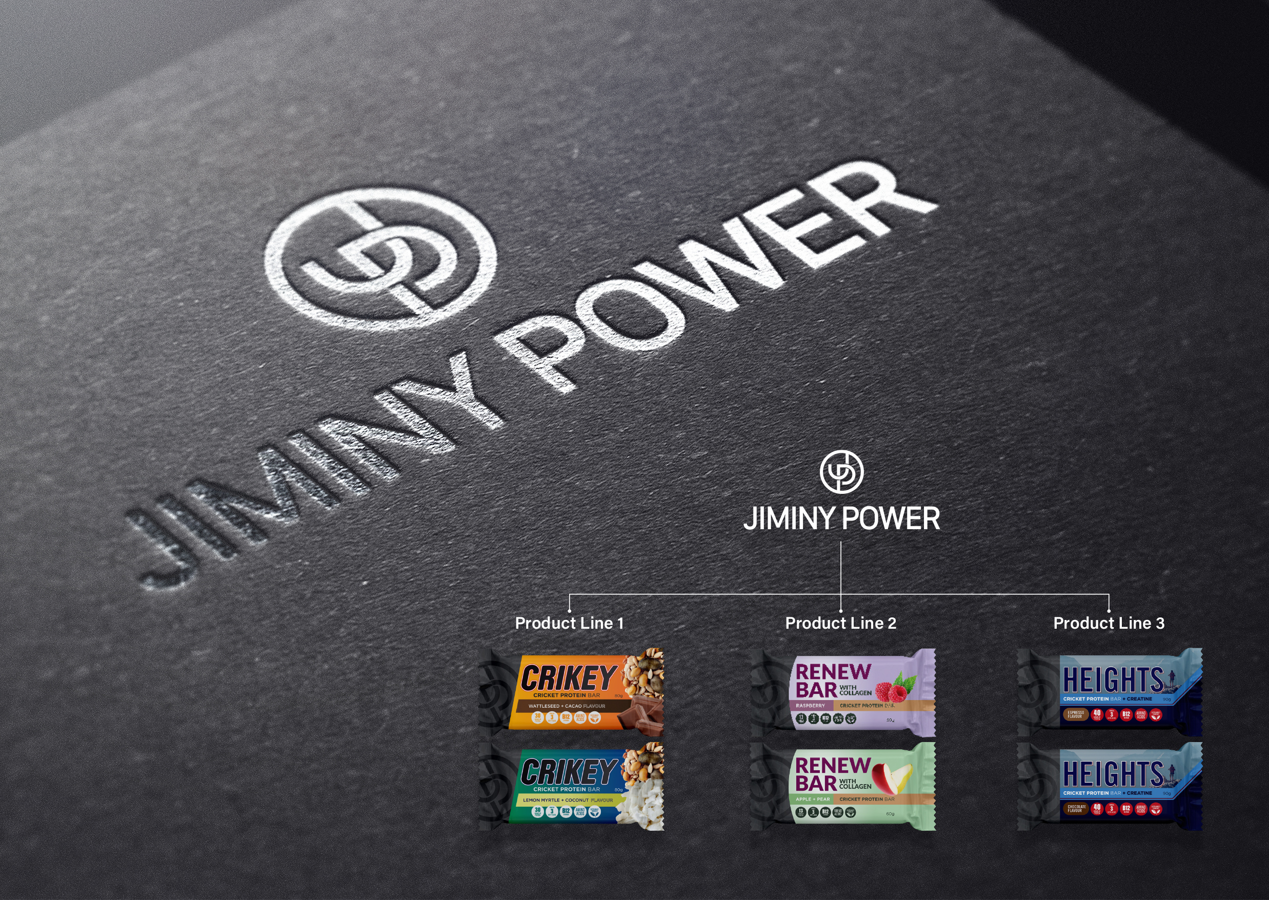
The outcome was a brand architecture that sat with the master brand: Jiminy Power at the top and three product skus underneath. The master brand held the overall brand vision, mission, values and oversaw these attributes applied to the sub-brands. The three sub-brands consisted of:
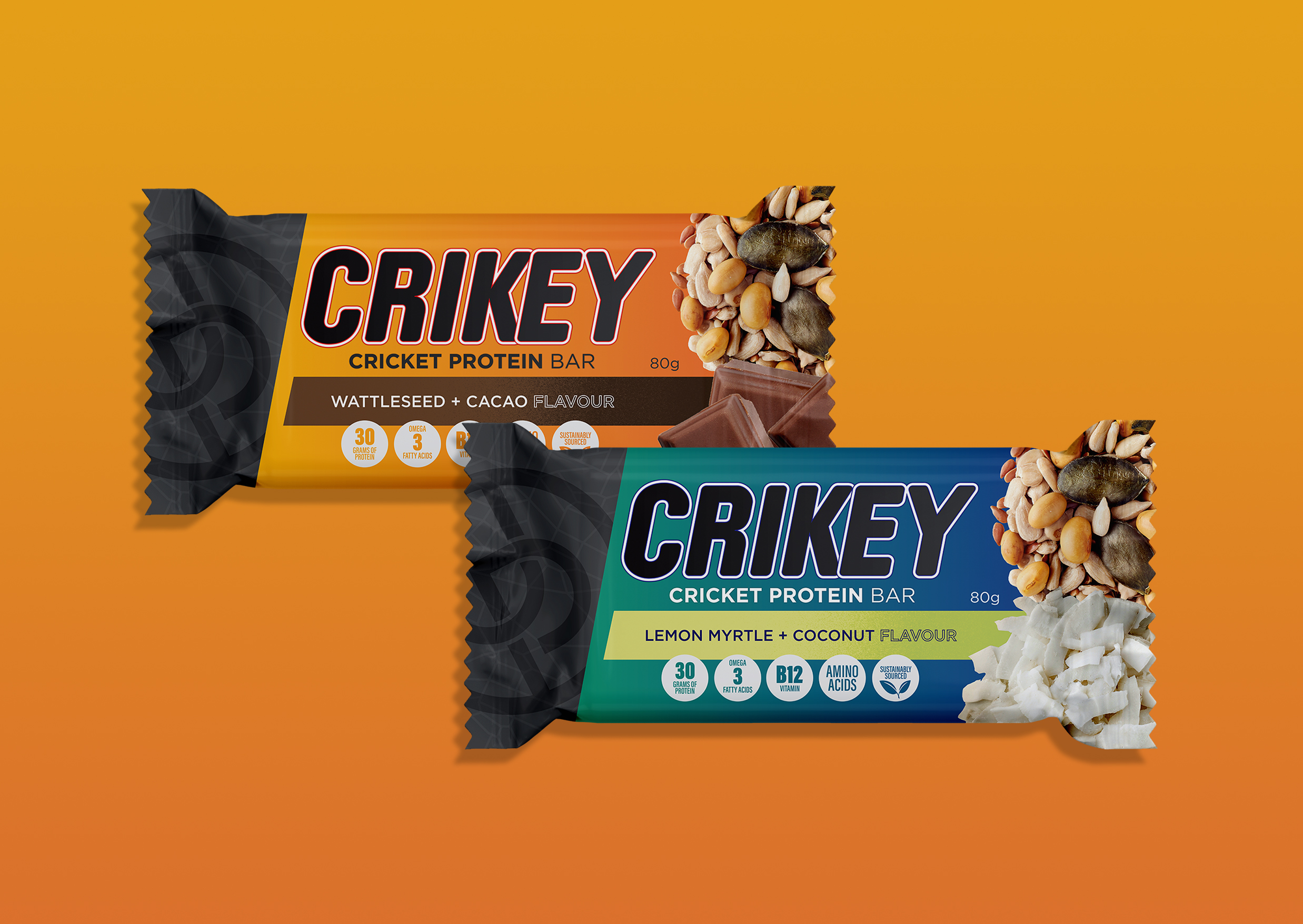
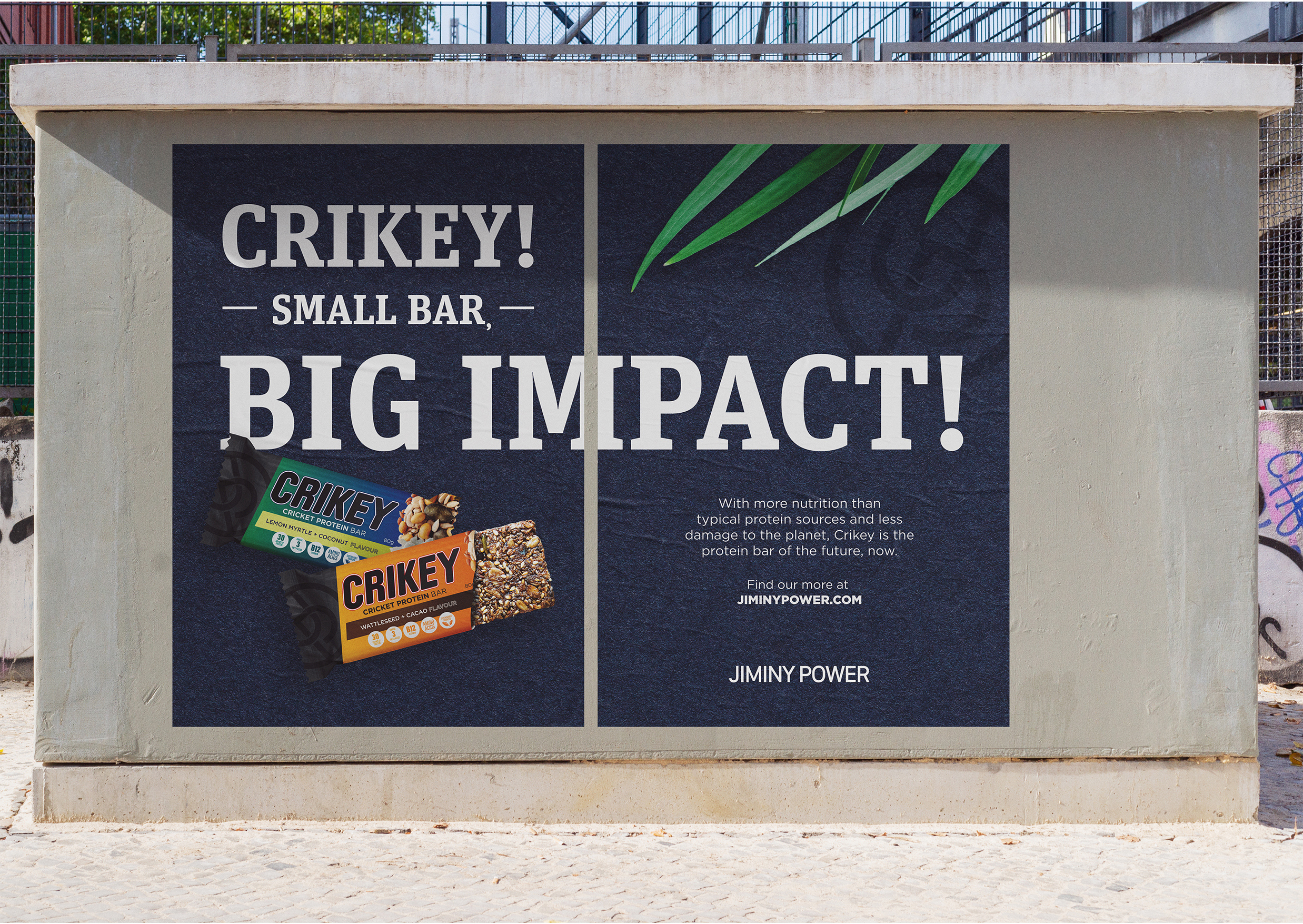
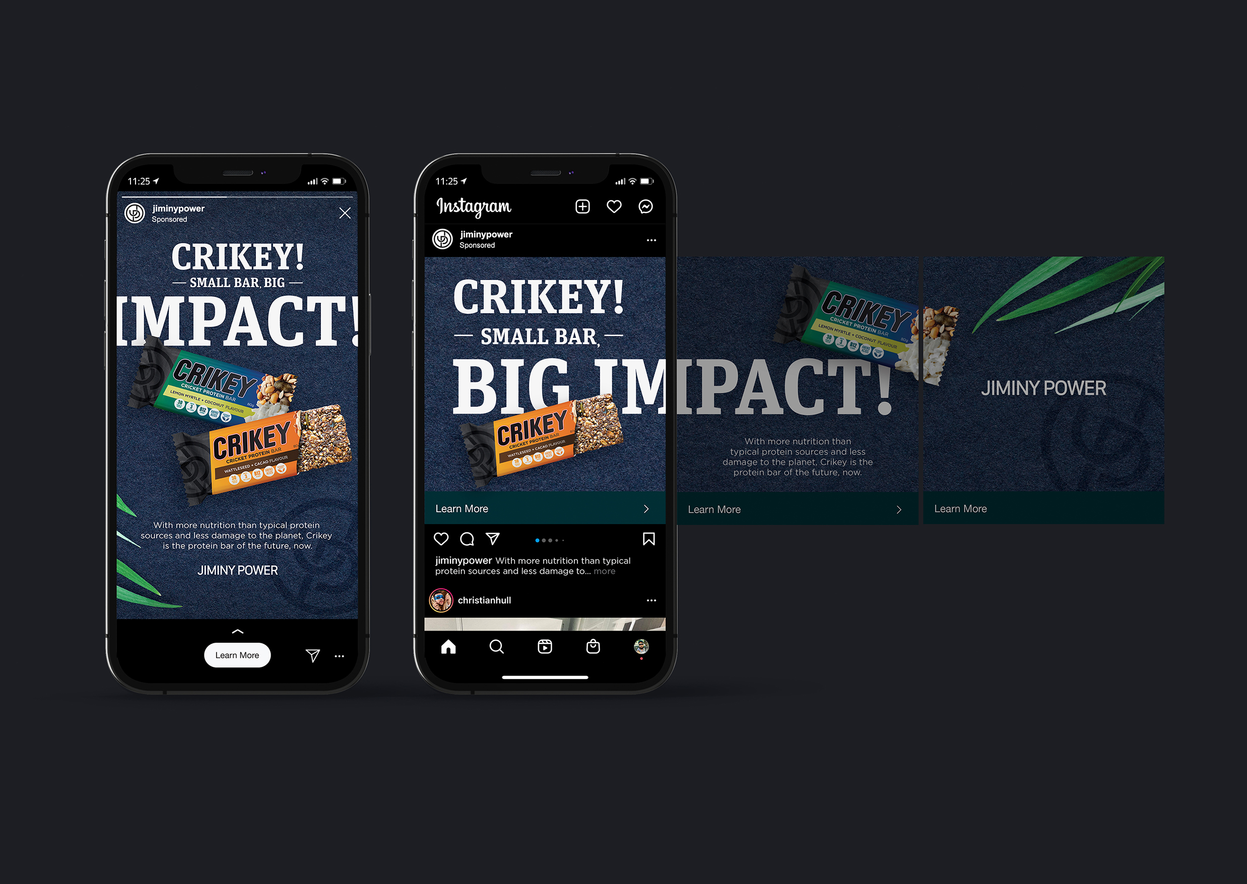
1. Crickey Bar; the entry-level product flavoured by Australian native ingredients
2. Renew Bar; the women focussed product with the addition of college and anti-oxidant based fruits
3. Heights Bar; the premium product with a focus on elite athletes with the addition of creatine, used to promote improved performance.
The brands were then explored through a marketing lens and a multi-platform strategy and campaign was developed to leverage the benefits of Cricket protein powder over alternatives.
My role consisted of creative director, marketer and graphic designer for the project.
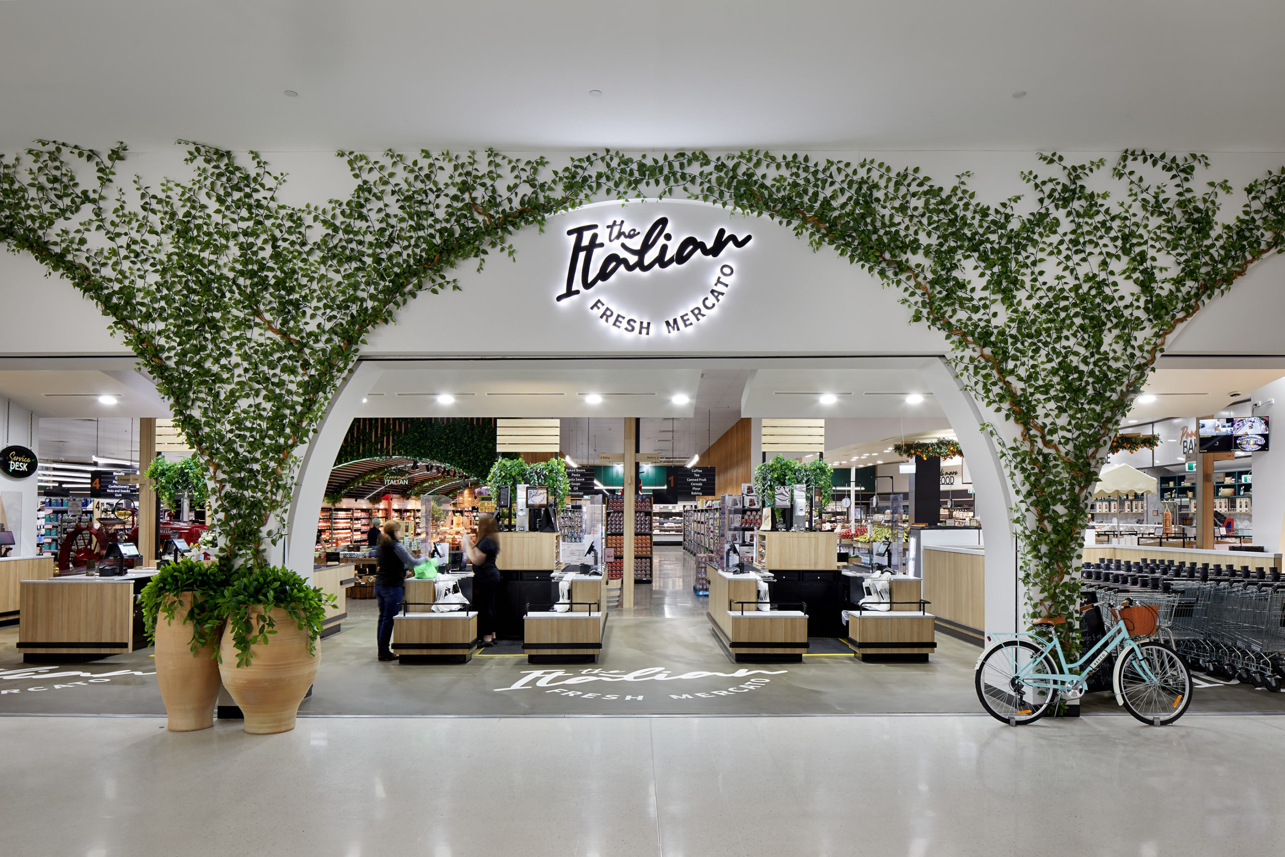
Located in Griffith, NSW, The Italian Fresh Mercato is a newly designed and delivered powerhouse of the Griffith community. The supermarket offers the product range of a large supermarket, with the warmth and bespoke joy of a local Italian delicatessen. Leveraging the incredible fresh produce of the Griffith region, along with an extensive product list of curated, imported Italian products, The Italian Fresh Mercato has quickly been embraced by the largely Italian/Australian community of Griffith.
i2C Architects’ Interior Design and Branded Environments teams were engaged to design the brand identity, environmental graphics, signage, wayfinding, and interior design of the new supermarket. This entry will focus on the wayfinding and signage system as it perfectly demonstrates the intent of the brand identity I created and its cohesion with the beautiful designs created by the i2C Interiors team.
With a target audience of predominately migrant Italian, second-generation Italian-Australians, and multi-generation Australians, the design idea centered around “A taste of home”. This idea leveraged both the growing foodie scene in Griffith and the foundational idea of Italian’s being very food proud. This led to the development of a brand identity that was anchored in the idea of passionate Italian hands and the fluidity of cooking.
The logo itself is constructed through script-style handwritten typography, reminiscent of the passion, flow, and musicality of the Italian language, anchored with the more stamp-like quality of the secondary san-serif typography. The approach to the logo construction allows for “The Italian” to become the primary descriptor, with the secondary text becoming the identifier, leading to a versatile and tidy logo for use now as well as any future brand expansion.
The identity then flowed through the branded experience instore to connect the brand with signage, environmental graphics, and interior designs. The use of both the Italian and English language in the design of the 10 major bulkhead signage elements allows for a direct representation of the local community and the coming together of cultures. This combining of language also provides opportunities for learning and the joyful experience of shared culture and connection, much like the passing down of food knowledge.
Taking a place-based approach, we looked to vintage Italy to build the colour palette and graphic strategy with nostalgic connections and features that honoured the historic, cobblestoned streets and vine-covered shops of Italy. This was then paired with references to modern regional Australia, such as the iconic orange tree something the Griffith region is known for, to create a truly place-based experience.
Since opening, the store has gained traction within the community to quickly become a leader in the region. The comments regarding how beautiful the store is and how it’s not like your usual supermarket suggests people are enjoying the store. Although we know this has a lot to do with the product range; the brand, experiential and interior designs play a critical part in the store’s success. Overall, we achieved what we set out to do by creating moments for the community to engage with the store and feel a welcoming comfort, just like a hug from Nonna.
My role was as Creative Director, Brand Strategist, and Graphic Designer.