Hi, My name is Kumi and I am a hardworking individual who strives to develop numerous skills to grow as a professional designer. I understand the importance of working as a team and am highly motivated to immerse myself in a design-based career.
I am a recent graduate with a Bachelor of Interior Design (Commercial) from Billy Blue College of Design at Torrens University and hope to learn much more about the industry.
I am passionate about creating unique designs while maintaining the values and needs of my clients. I have many transferrable skills such as working well under pressure and on a deadline and being highly adaptable during the creative process to cater to any clients' needs. I also regard creating spaces with attractive and functional designs to be highly valuable.
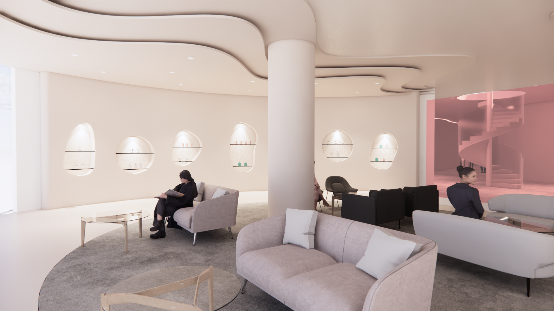
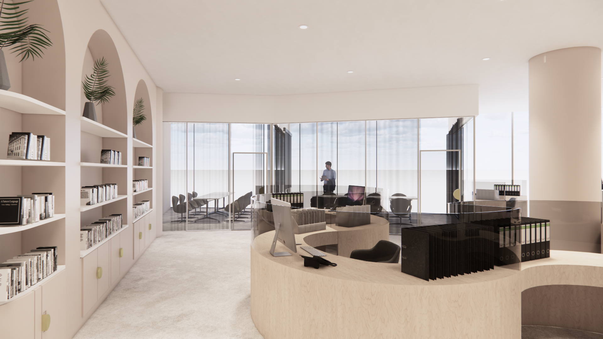
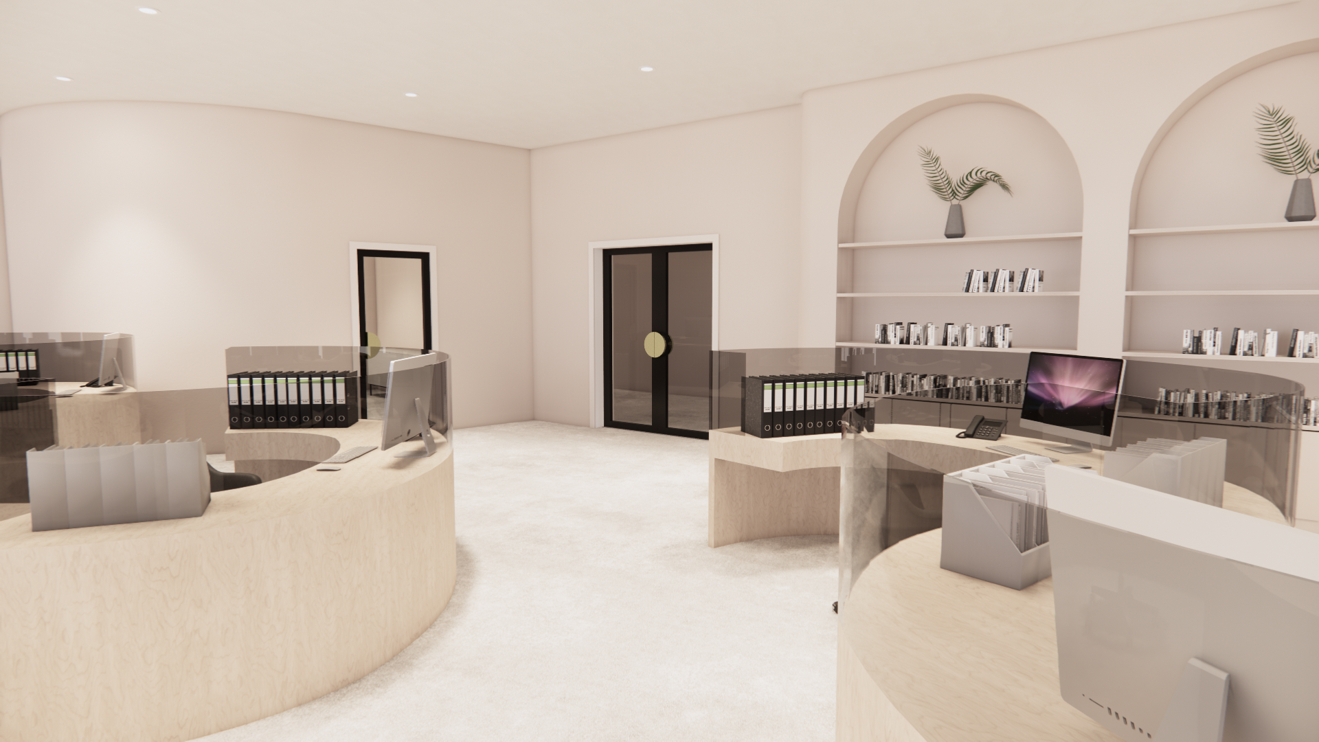
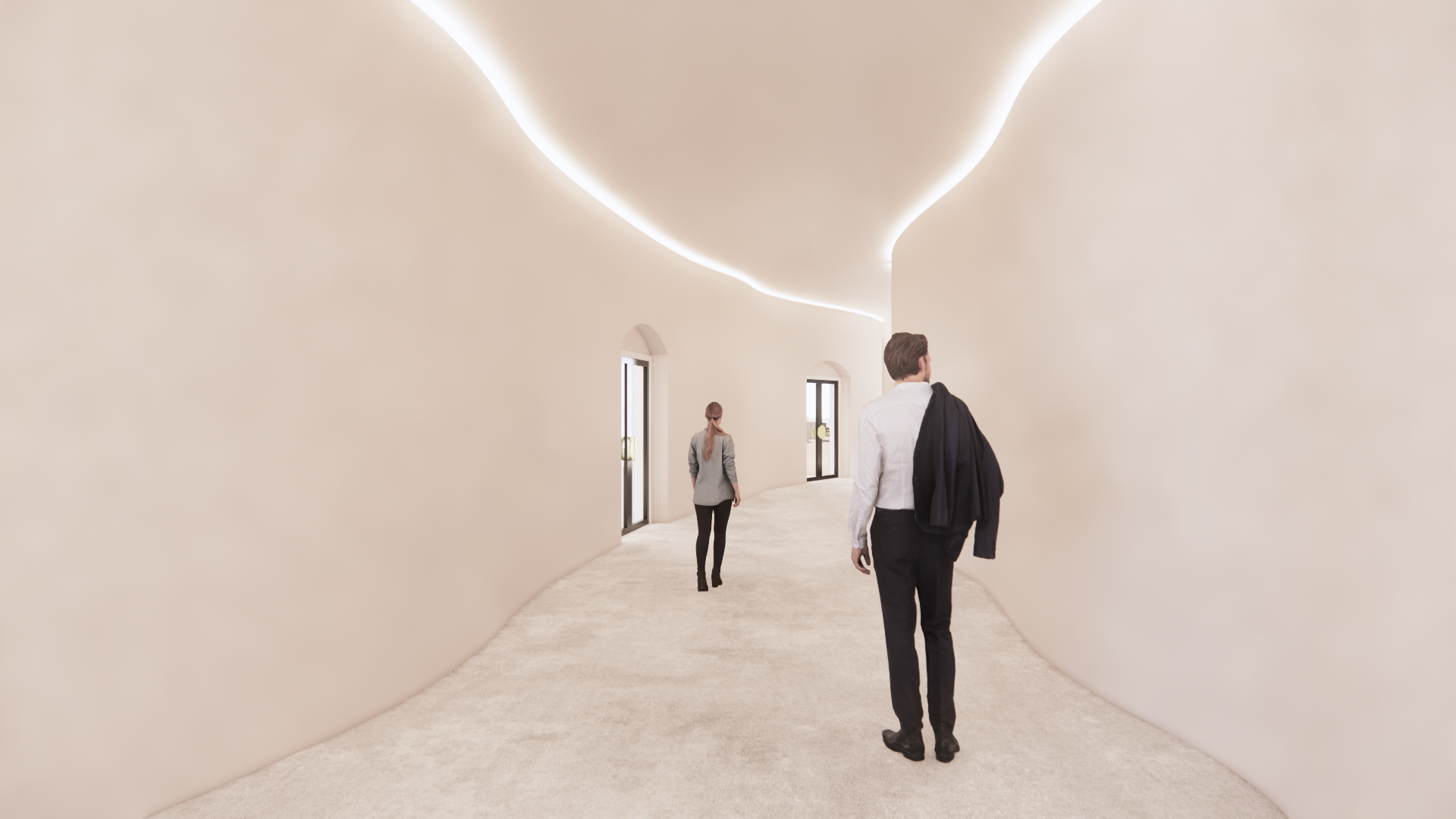
Natura & Co is a Brazilian global personal care cosmetics group headquartered in Sao Paulo. Natura Cosmetics, Aesop, The Body Shop, and Avon are their current Group brands. Their brand concept is eco-friendly and sustainable, using natural products. The concept for this design focused on creating a comfortable, relaxed environment that feels more like a natural resort than a classic workplace.
The office is separated into seven zones: a waiting area ( cafe, display), a public meeting area, two separate offices with two private meeting rooms, a private break-out room, and a VIP room.
Organic, rhythmic forms echo the roundness of the building’s exterior. These were contrasted with dynamic curves and powerful arches to provide a sense of structure and comforting containment. Irregular, organic-shaped apertures in the walls function as display areas for products and are sensitively lit to evoke calm.
Natural materials are a significant feature within this interior design, with concrete flooring, rich sandstone texture walls, soft fabrics, and natural timber providing a relaxed, pleasant atmosphere.
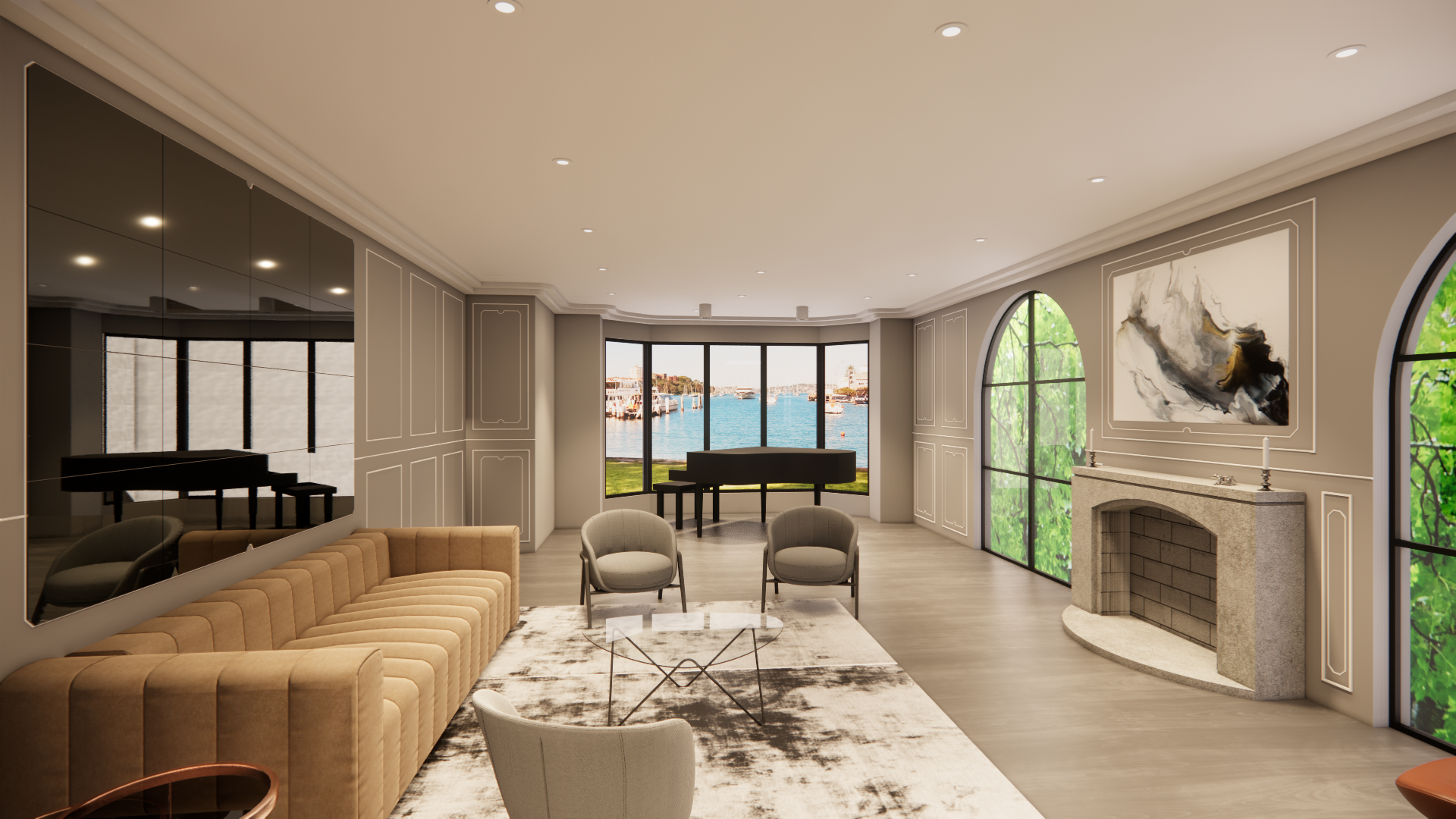
The client is a couple who is early 30's with two children. They wanted to retain the Victorian Italianate style but also allow for the inclusion of modern furniture, finishes, materials, and fabrics.
The Italianate style was retained in the new design but a modernist touch was added through the materiality and contemporary furniture with clean lines. the home is expressive, not minimalist, and specific to the family's quirky taste. Arched windows and hallway allow light to flood through the spaces and provide a softer, curved geometry compared to the angularity of the furnishings.
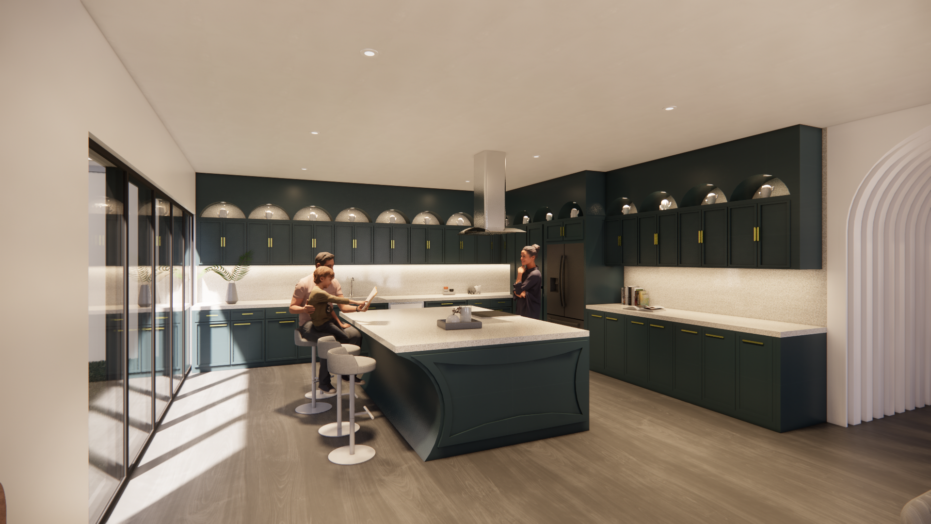
The house has two floors. The lower level includes a dining room, opening kitchen, living room, home cinema, home office, laundry, bathroom, and garage. The dark blue laminate finish of the kitchen joinery with light concrete-look tile benchtop, combined with Oka timber flooring keeps a balance of warm and cool. Everything is paired perfectly with brass hardware. There is also a hidden walk-in pantry inside the cabinetry.
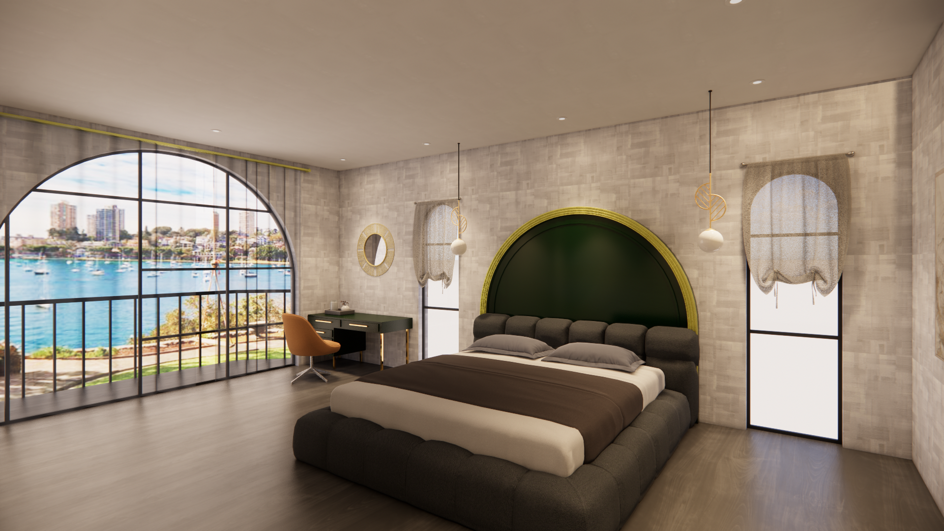
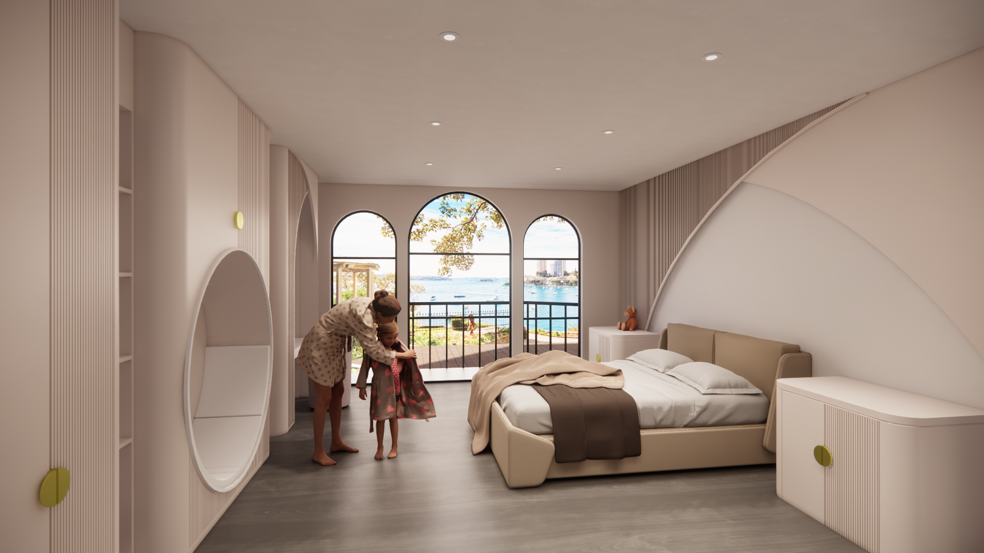
The upper level includes five bedrooms, a bathroom, and a storage room. The master bedroom design is luxurious and elegant in warmer tones to generate relaxation. The grey-tone bathroom with concrete-look tiles provides a refined and easily maintained surface. Kids' rooms are designed in a soft, creamy tone with a warm lighting tone. In addition, the custom wall joinery gives a playful and welcoming element.
